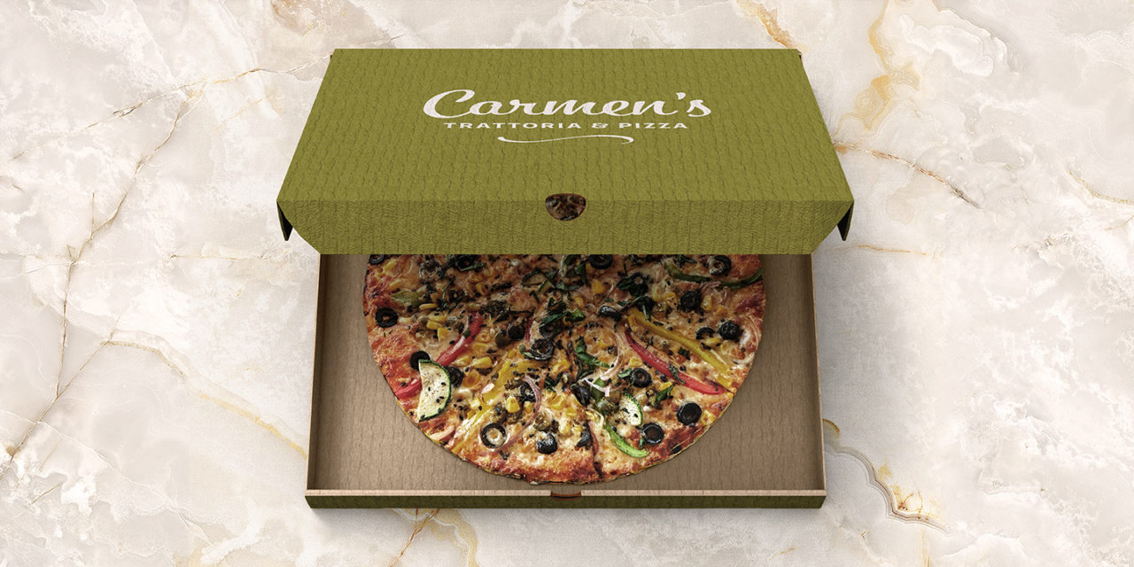
Carmen’s Trattoria
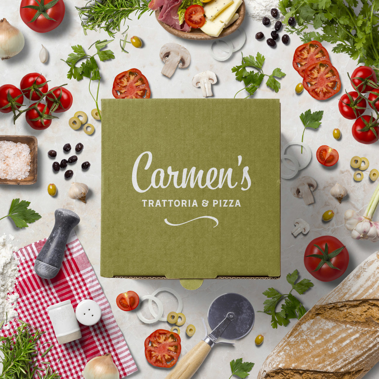
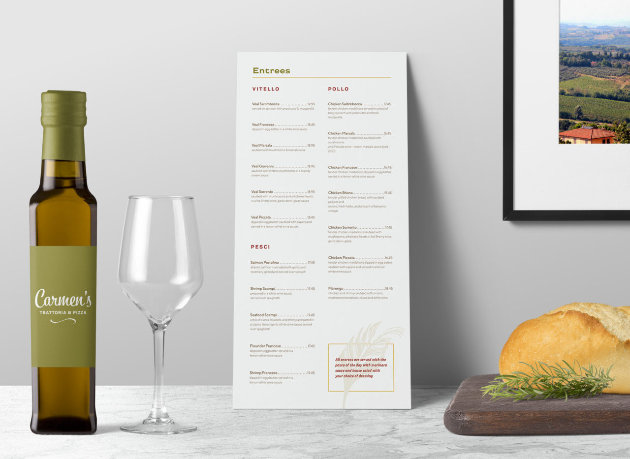
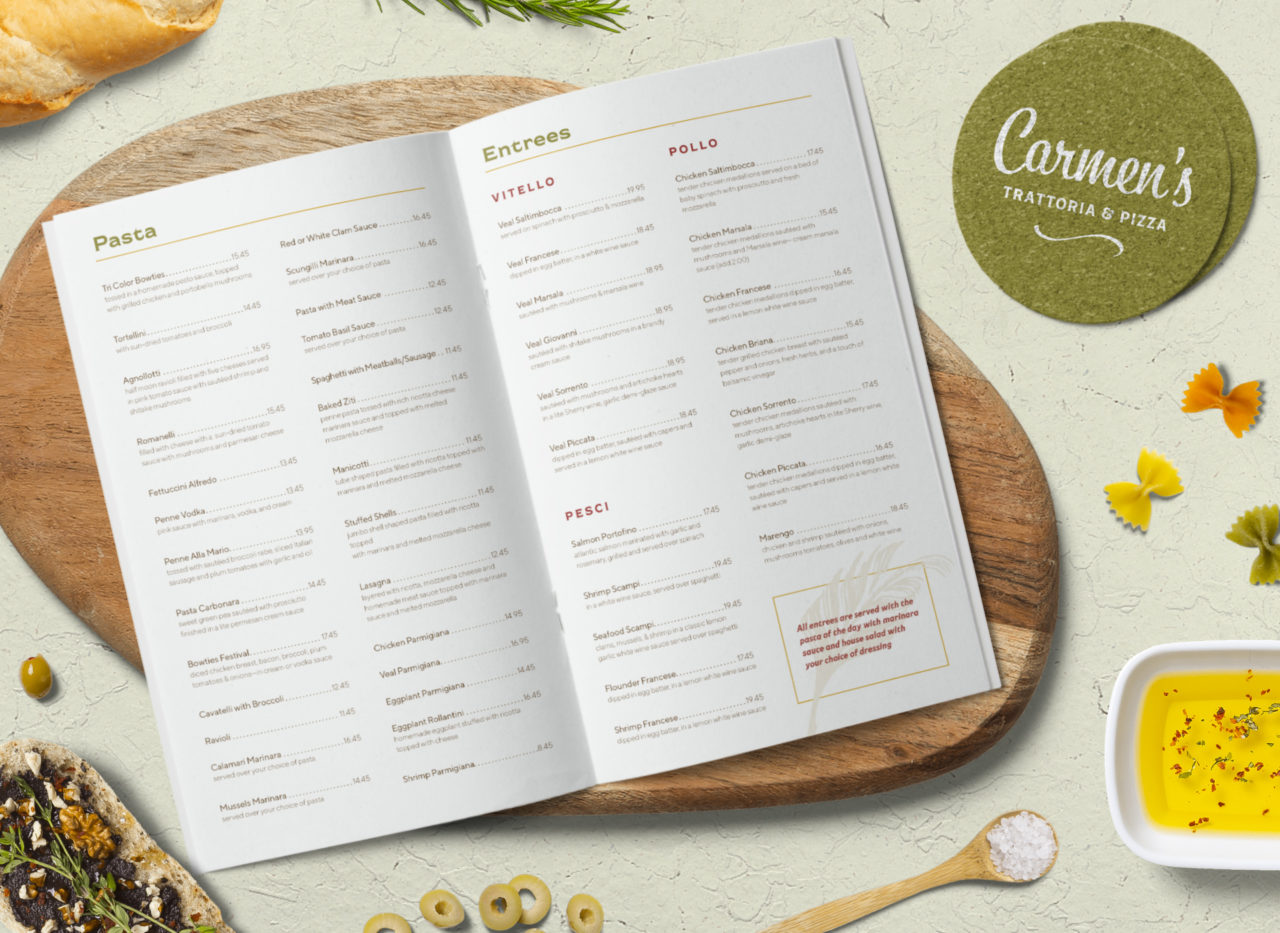
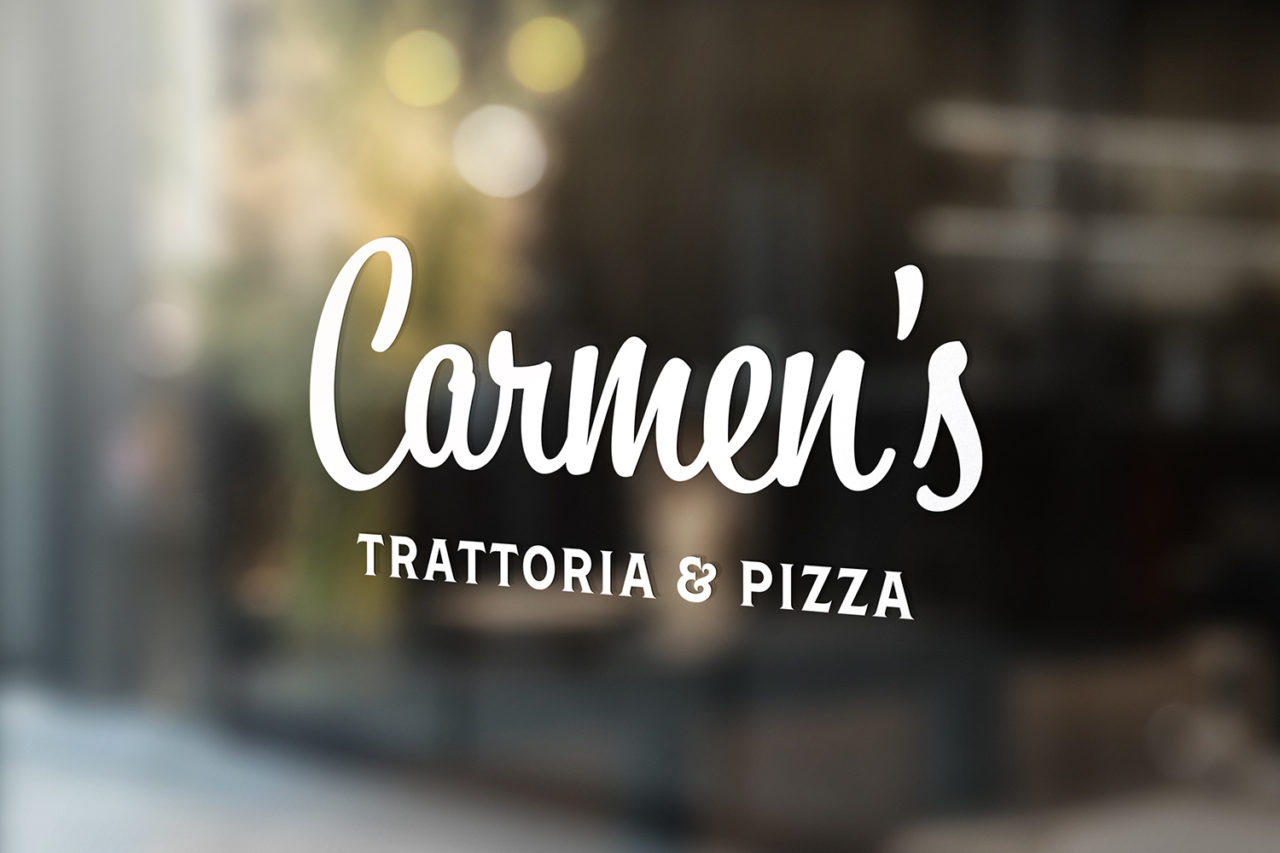
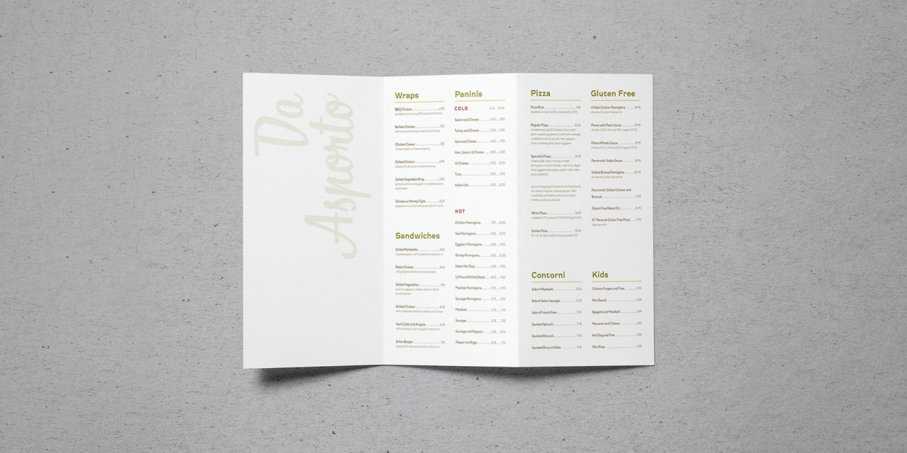
In rebranding Carmen’s Trattoria & Pizza, a local New Jersey Italian restaurant, I strove to maintain its homey and comforting personality and ambience. At the same time I wanted to upgrade its materials to reflect a more sophisticated and refined aesthetic. This entailed updating not only the logo, but also the menu design, pizza box packaging, and interior signage. The food itself was very upscale, but the existing branding did not reflect this.
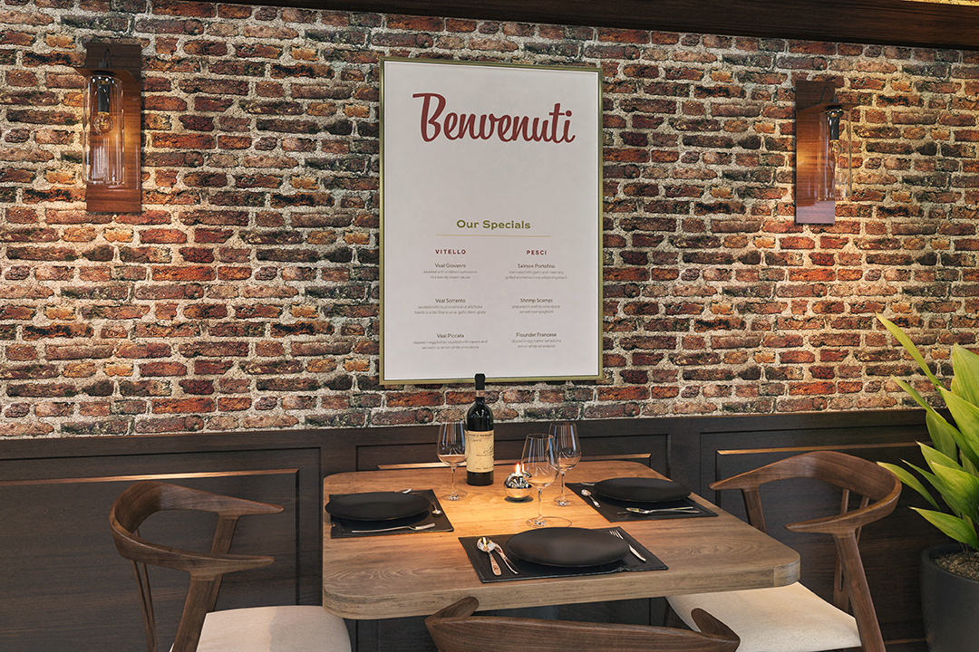
The logo would set the tone for the remaining collateral, so I knew it had to have a solid foundation. Inspired by the restaurant branding work of the infamous Louise Fili, I paired a friendly script with a monoline serif to create the logo. The swooping line underneath references a tray with which to serve food. The subliminal messaging that I wanted to connote was that this trattoria was here to serve you.
Warm hues and subtle typographic hierarchy further establishes the level of sophistication that Carmen’s deserves. I strove to make the words themselves visually appealing and allow the descriptions to speak for themselves. Certain classic Italian phrases such as “Buon Appetito” and “Benvenuti” were also incorporated and given prominence. I also chose colors directly from Italian cuisine: red for marinara sauce, green for olives, beige for pasta, and brown for mushrooms. In this way, Carmen’s was able to keep with its traditional Italian roots, but utilize a more modern aesthetic.