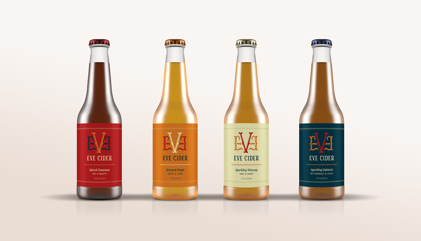
Eve Cider
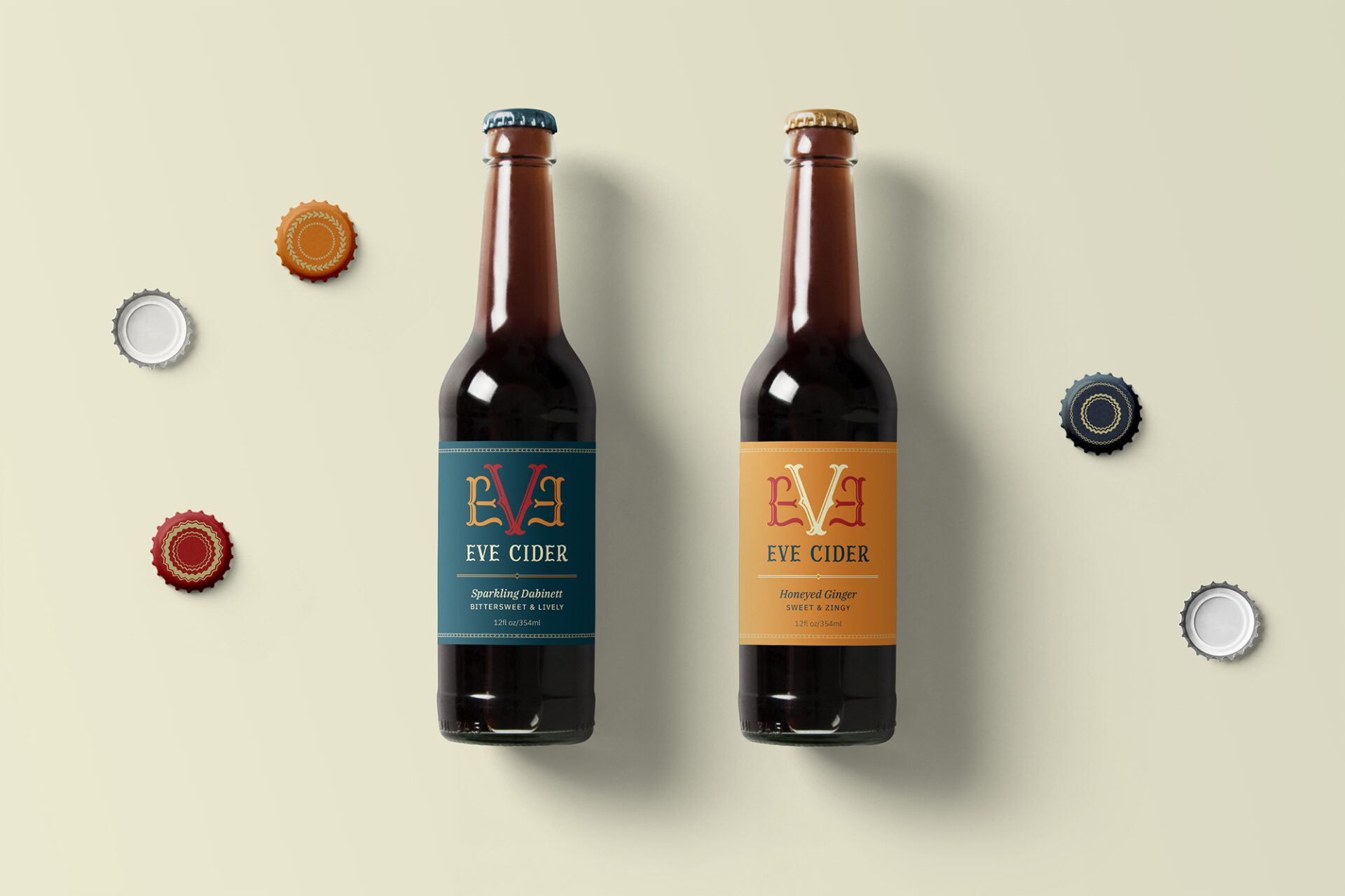
Eve Cider, a hand lettered cider brand, strives to be warm and welcoming while at the same time inspiring passion and a zest for life. It is derived from the Garden of Eden storyline and its tagline is: Eve Cider – the wise choice. I fully developed and executed this package design from the ground up.
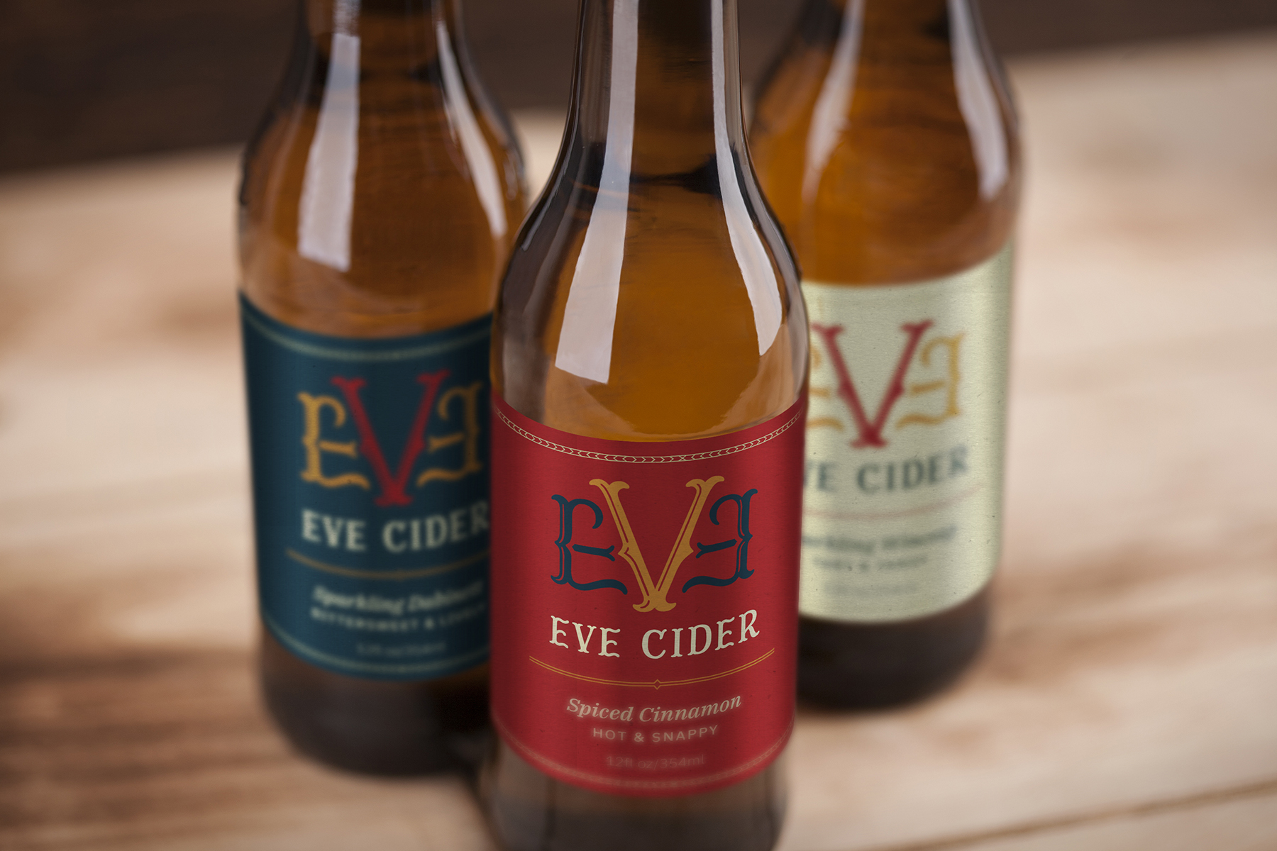
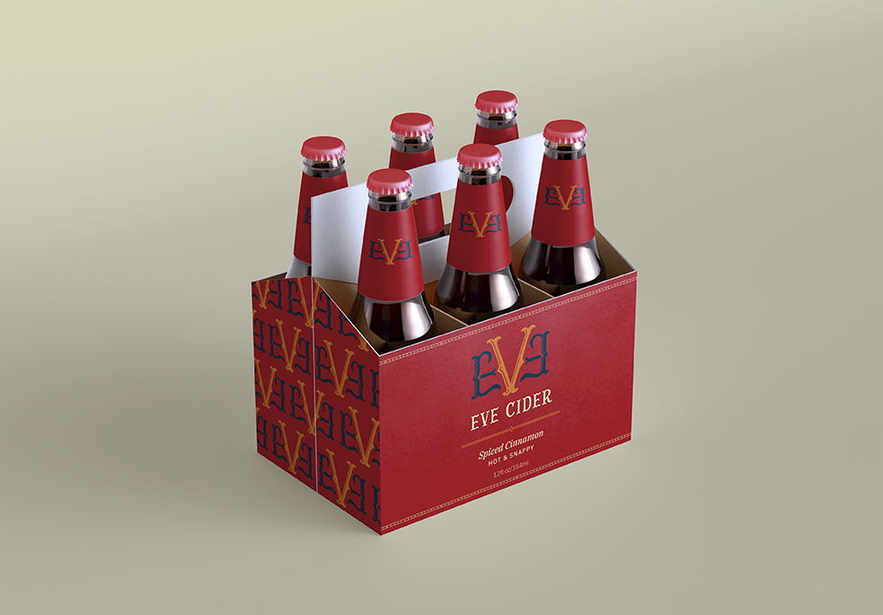
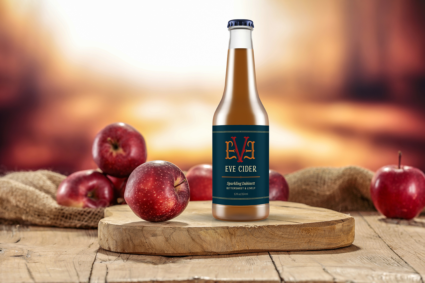
The first step was to establish a warm and vibrant color scheme. The four colors needed to not only represent each flavor profile, but also work well together to provide enough contrast. I knew I wanted to replicate the strong emphasis of the angles and symmetrical nature of the “v” in Eve. I therefore chose to include subtle diamond shaped patterns as a separating linear element, a border pattern, and a decoration for the cap. The logo’s hand lettered bifurcated serif further emphasizes this “v” pattern.
Because the inherent nature of the Garden of Eden was to be pure and simple, I knew that I didn’t want to create a complex package design. Instead, I wanted the flavors and descriptions to speak for themselves. I carefully researched these flavors based on each apple’s flavor profile and usage. Coupling subtle patterns with a warm and vibrant color scheme make this cider eye-catching, friendly, and visually engaging.