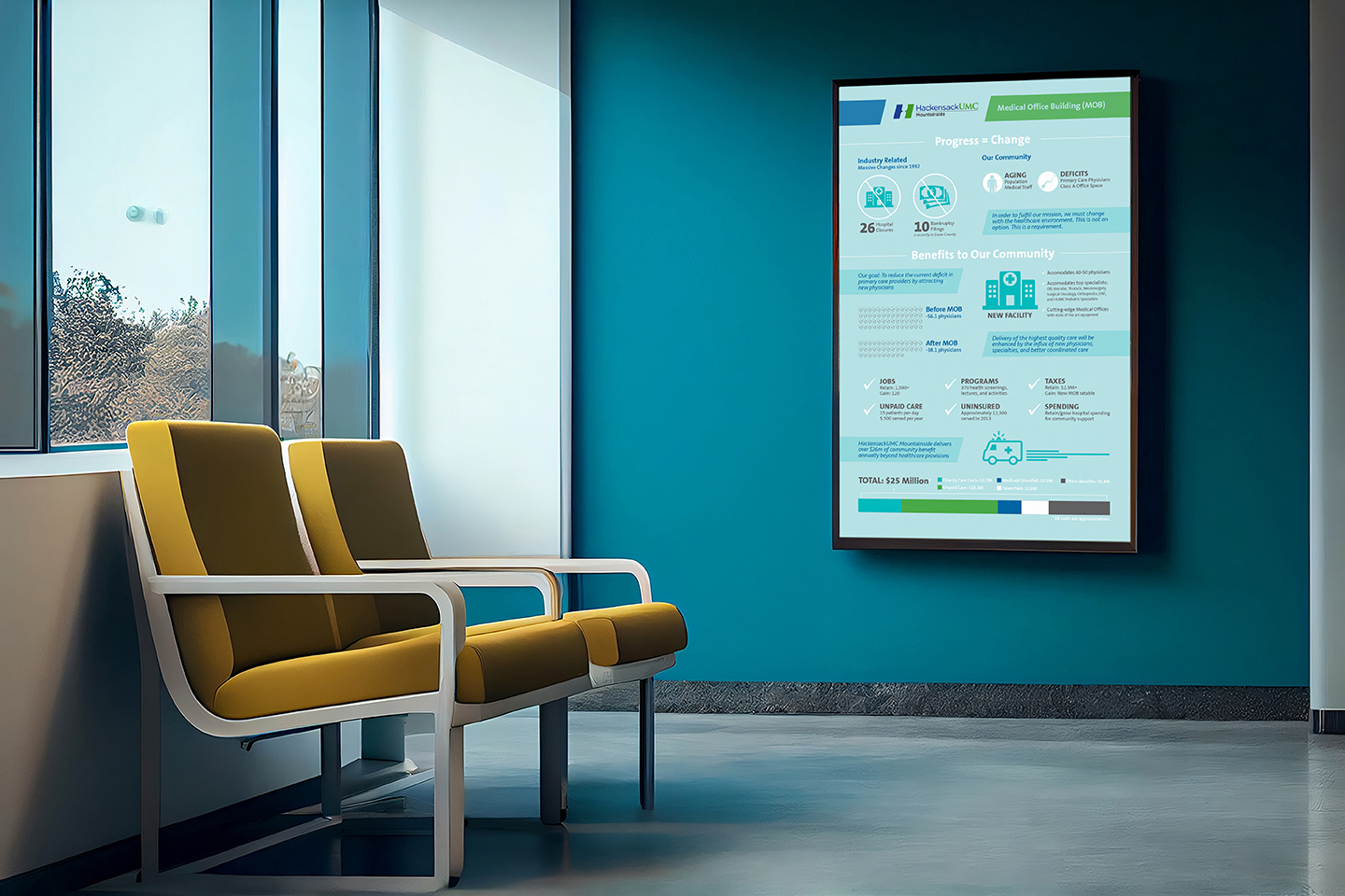
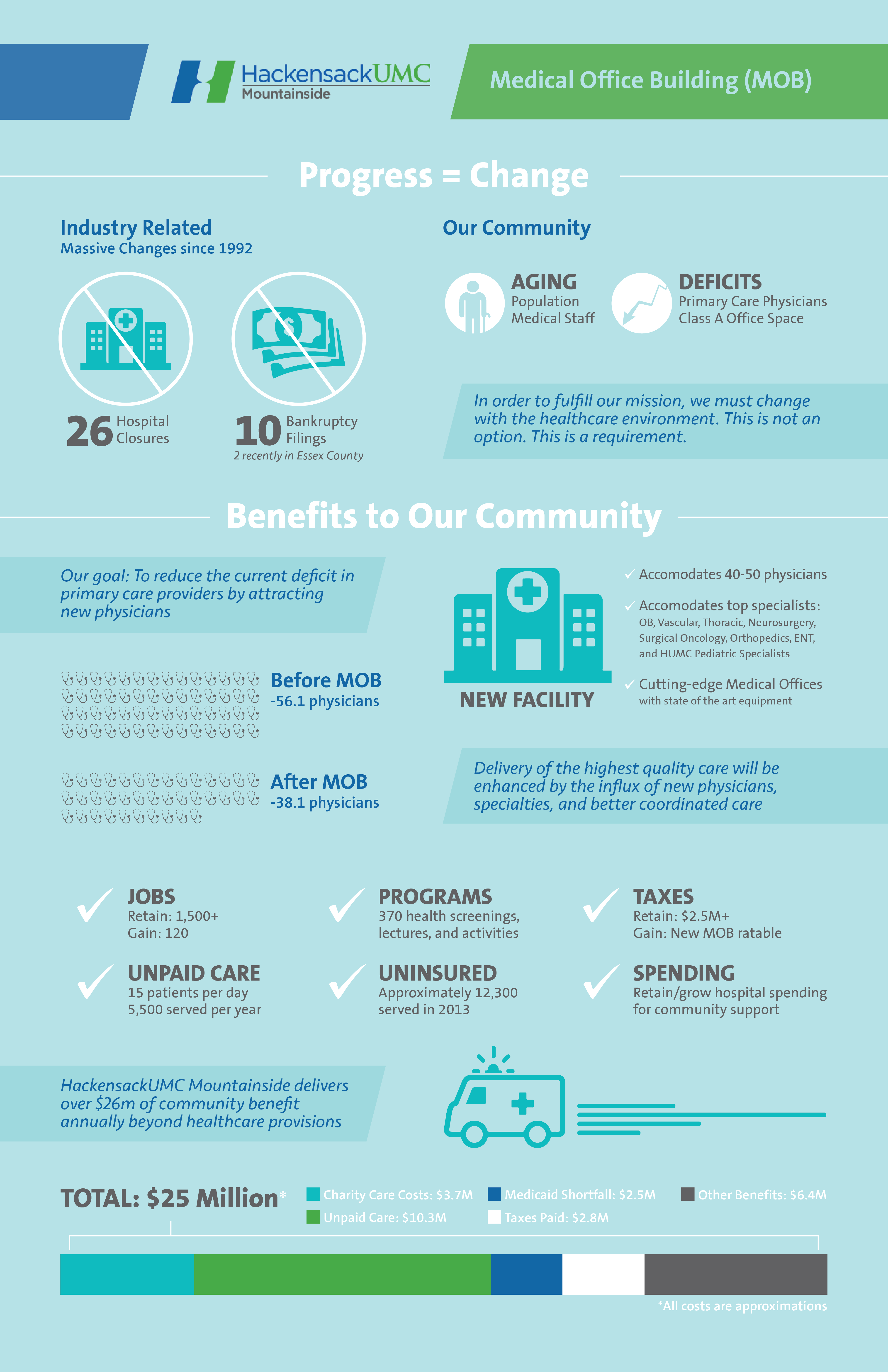
Hackensack University Medical Center’s goal was to create an infographic that would communicate effectively to their community the strict necessity for a new medical office building. This argument was very thorough, so condensing the information and establishing a hierarchy was the first step. I utilized the subtle angles within the hospital logo as well as strong and compelling visuals to realize this design. The diagonal served not only to reinforce the brand but also the lead the eye down the page. The information itself was quite complex so I broke it up into smaller digestible segments and coupled it with iconography.
There were many different types of information displayed; it was therefore important to maintain a level of consistency while still distinguishing between the content types. The numerical statistics, the callout copy, and the charts all needed to speak with the same visual voice while maintaining their own identity. Above all, this infographic needed to communicate the necessity for a medical office building and the benefits it would bring. Its goal was to not only educate the audience, but to convince them. This infographic showcases the impact that this project would have on the Hackensack community and the progress that would be achieved.