When crafting the identity for someone’s special day, there are many things to consider. Largely, this comes down to the bride’s personal vision and aesthetic. However, there are several other factors: the quintessential mother-in-law input, the venue layout, even the occasional groom opinion. But one of the most important things in designing wedding collateral is that it must feel unique to the couple.
There are countless wedding templates out there – the whole reason that they reached out to you was for a personal touch. Sometimes the bride has had a vision for her wedding since the time she was seven, other times she looks to you for guidance.
Obviously knowing details like the wedding color palette and flower scheme is helpful, but there are many other nuances to note. What is the overall vibe that they want to provide for the guests? How would they describe their relationship? What tone of voice do they want to use for the collateral language?
Rustic Yet Refined
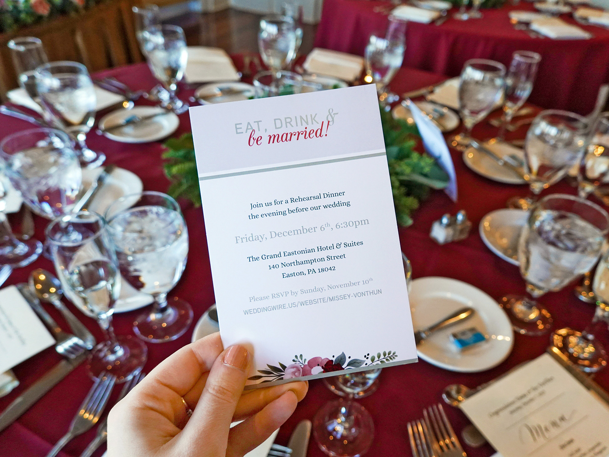
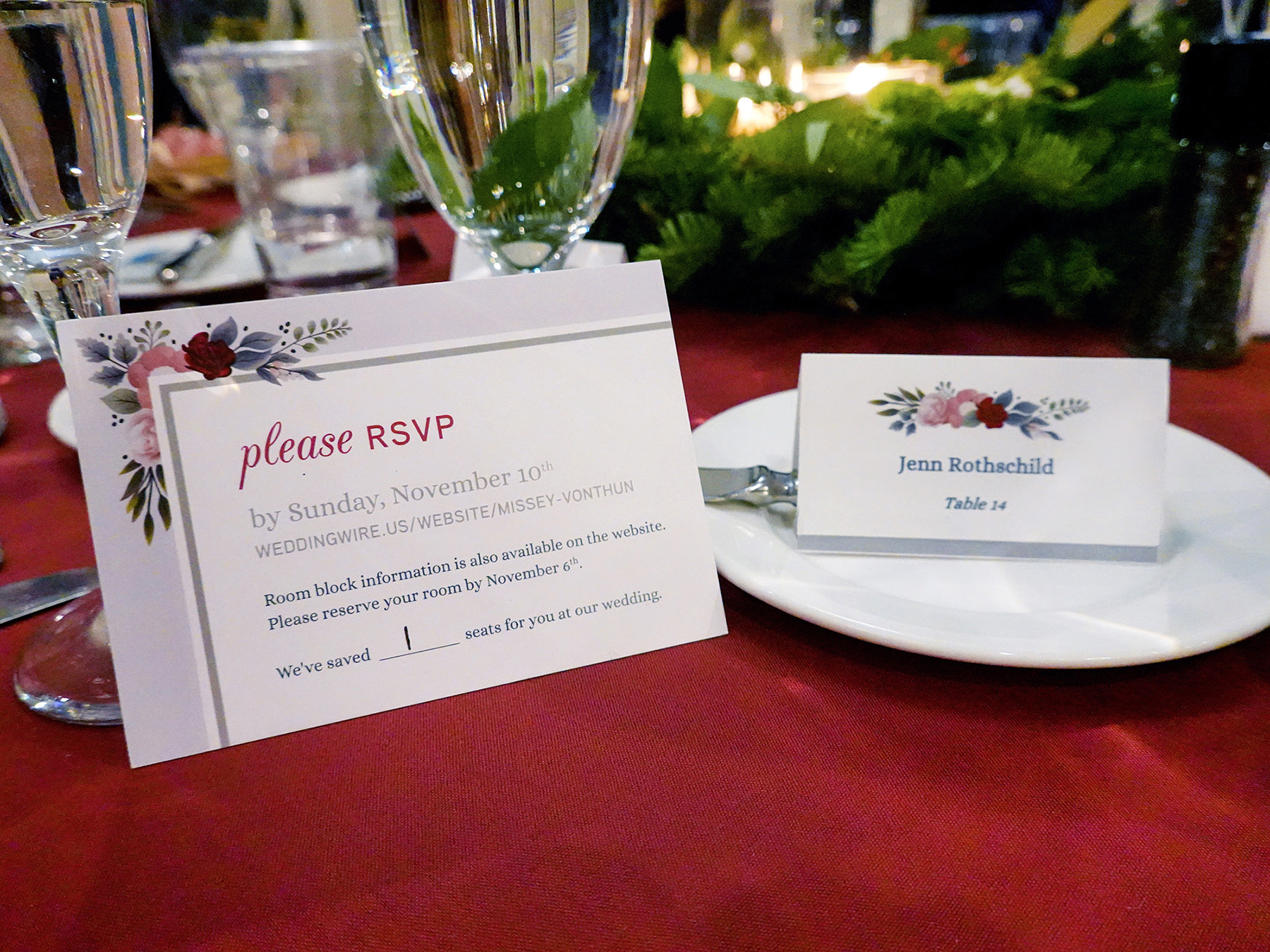
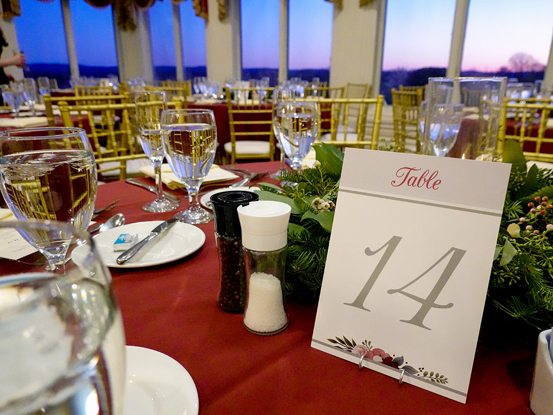
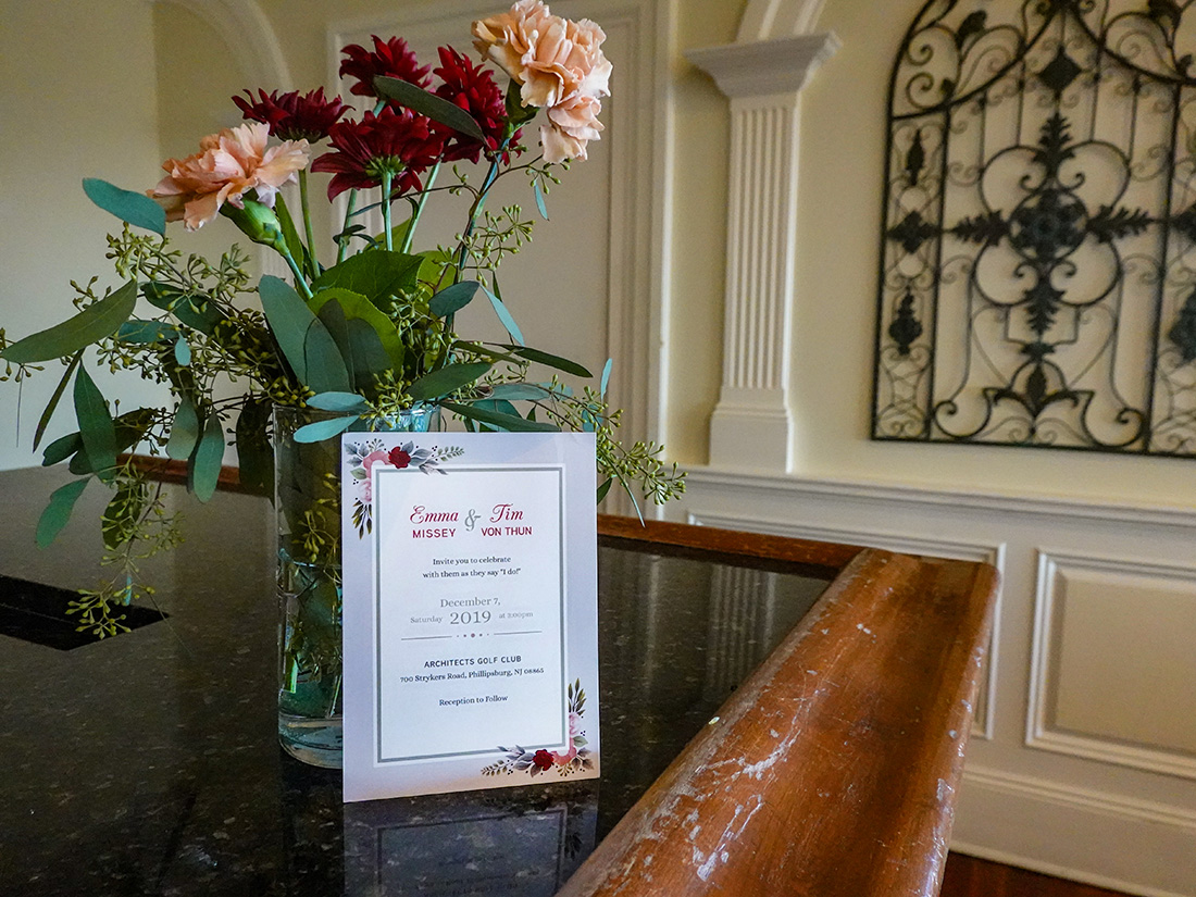
For example, the Von Thuns and their extended family were all farmers. Therefore, the bride wanted a system that looked rustic yet refined. For this winter wedding, she wanted seasonal colors that were festive but not too Christmassy. She wanted language that was brief and casual with typography that was playful and elegant. And she wanted an overall aesthetic that reflected the fact that they were down-to-earth people.

Personal Journey
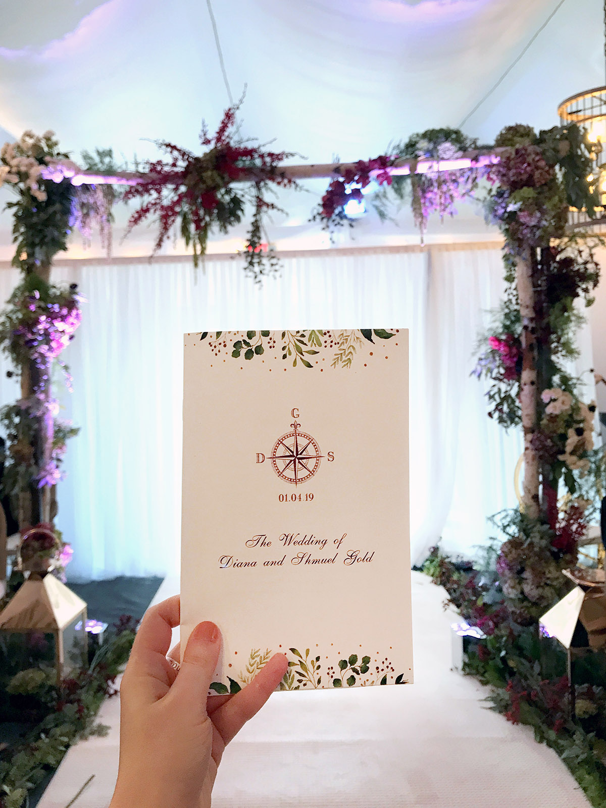
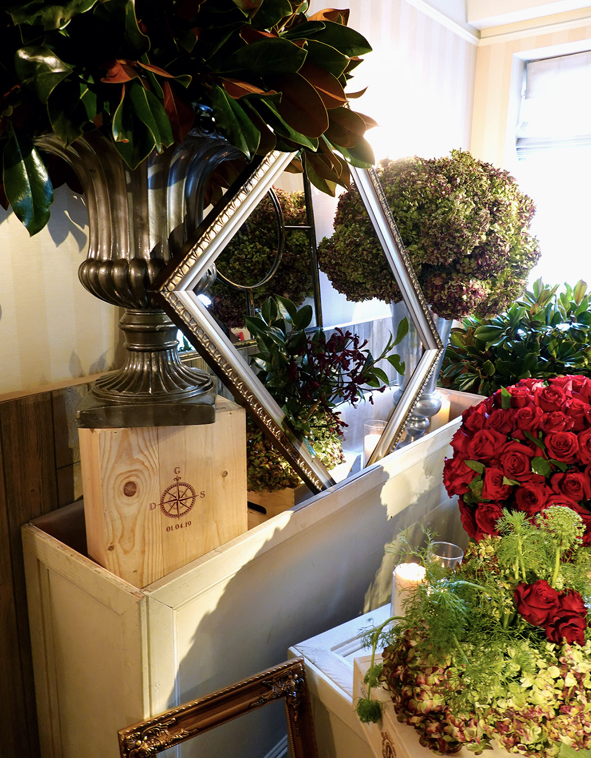
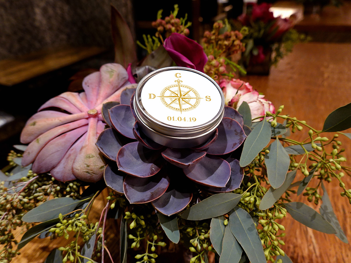
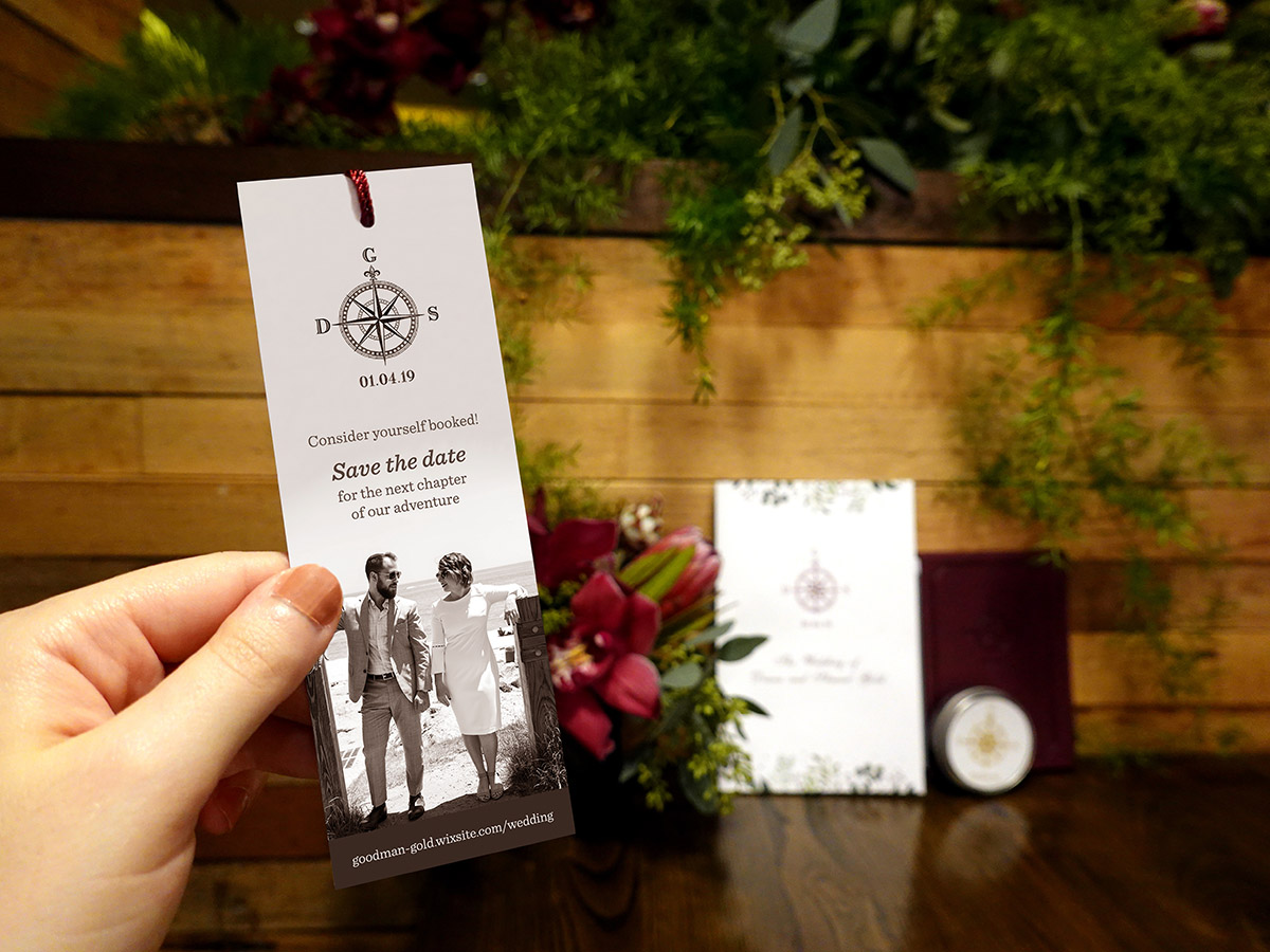
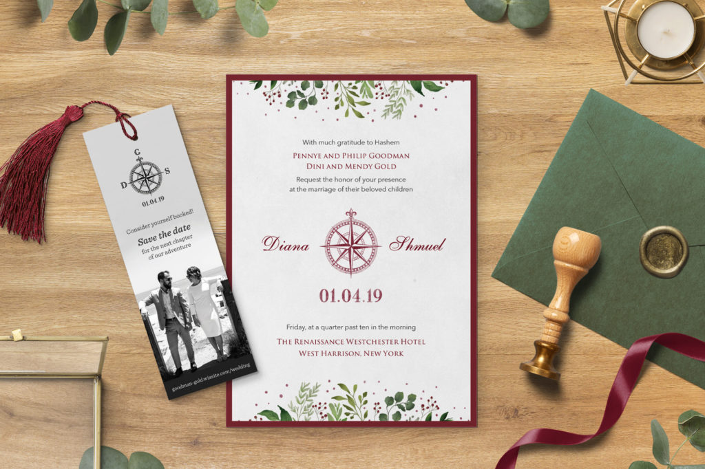
For the Gold wedding, also a winter occasion, the bride had a very different goal. She wanted to create a unique logo mark to include on the décor all over the venue. She wanted something that would capture their journey together while also speaking to the journey ahead. Her aesthetic was incredibly detailed and elegant and the design therefore needed to reflect that. The illustrated compass with their initials and wedding date was then featured all over the event.
A Celebration For All
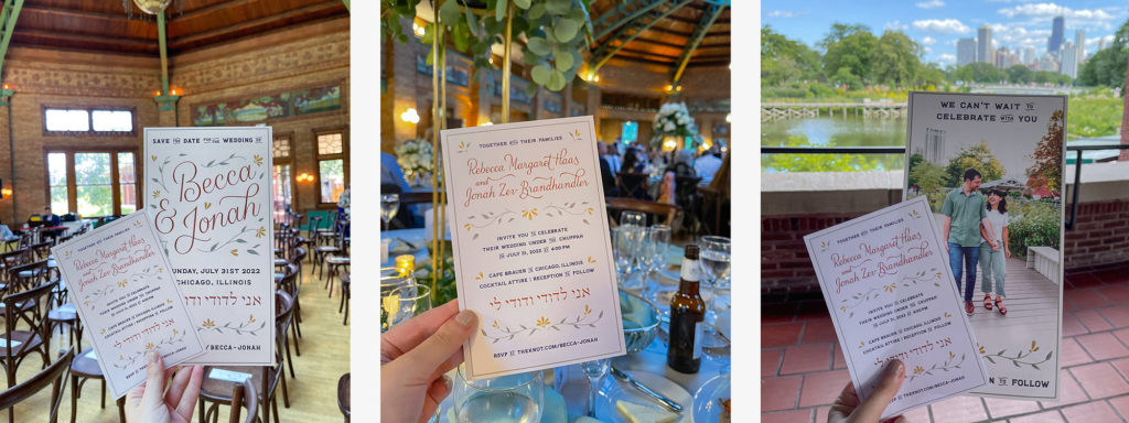
Lastly, the Brandhandler wedding gave me free creative reign. Since the couple didn’t have a specific idea in mind, I created a Pinterest board with several different aesthetics to gauge their interest. Once we had nailed down a concept, I hand-lettered this Save the Date. The bride wanted to emphasize that this event is inclusive, jovial, and most importantly a celebration. She wanted something fun, welcoming and summery.

Crafting a wedding identity can be challenging. Let’s face it– the industry is well-established and the market is fully saturated with content. Additionally, since it’s supposed to be the most important day of someone’s life, there are a ton of opinions, usually weighed down by extra emotion. But the most important thing to understand is that this is a special day and the materials should reflect that.