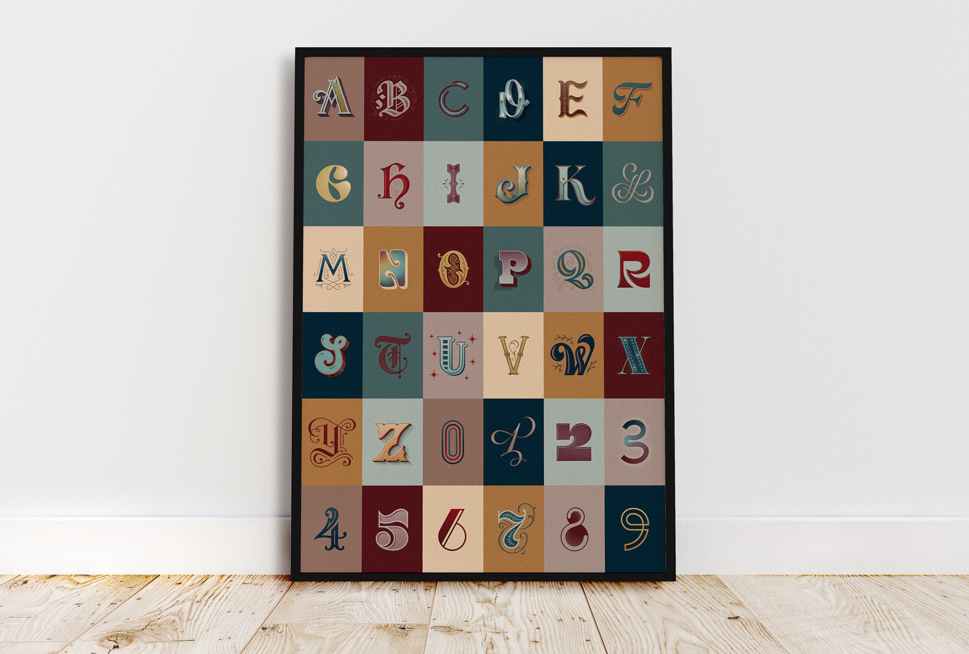
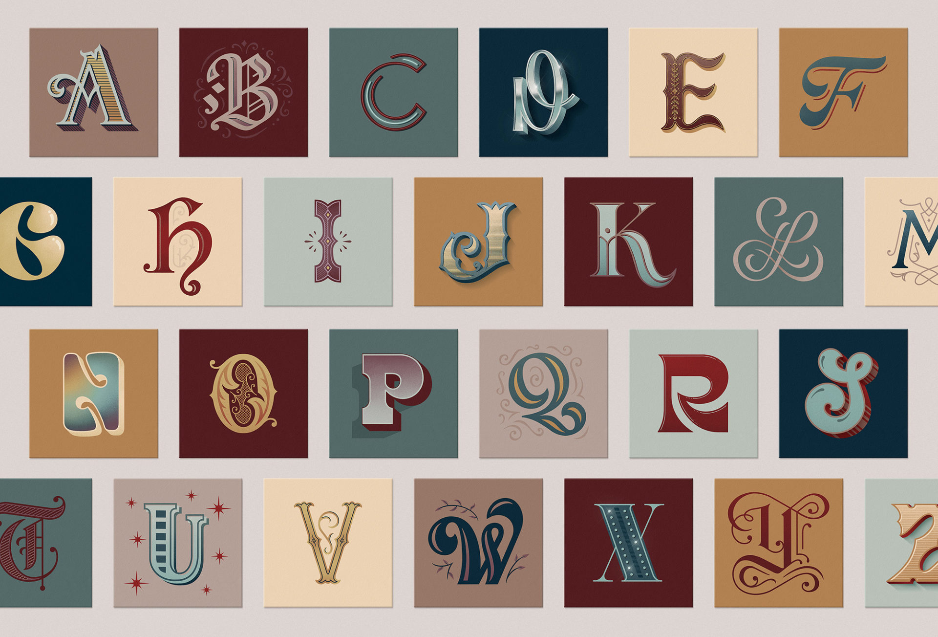
36 Days of Type
36 Days of Type is a project that invites designers, illustrators and graphic artists to express their particular interpretation of the letters and numbers of the Latin alphabet. It is a yearly open call exploring the creative boundaries of letterforms. Participants are challenged to design a letter or number each day for 36 consecutive days. This global effort produces an outcome that represents the same symbols from thousands of different perspectives. It aims to be a space for creation around typography and its endless graphic possibilities.
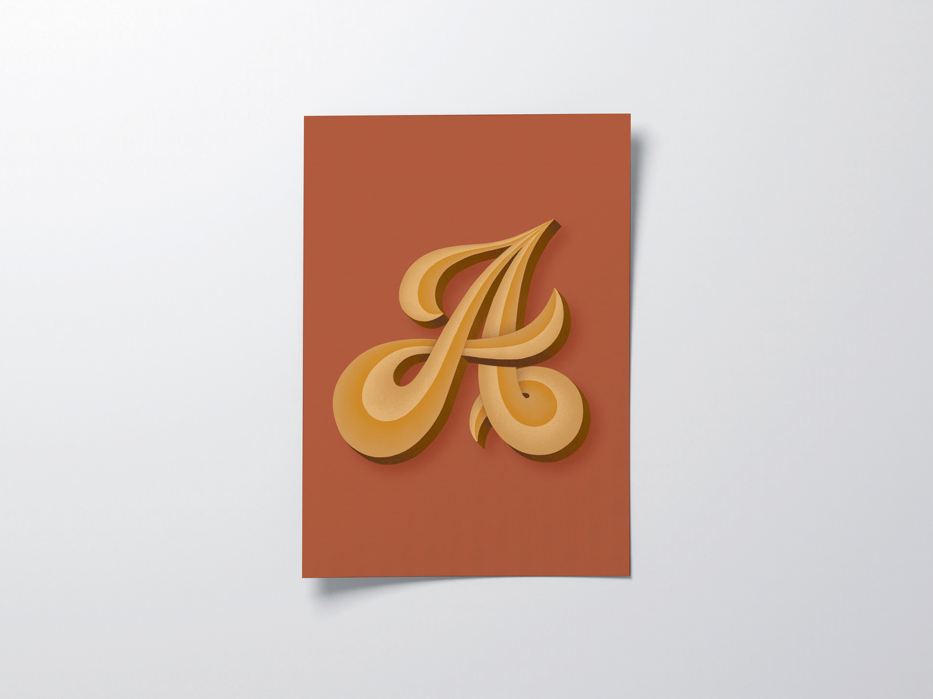
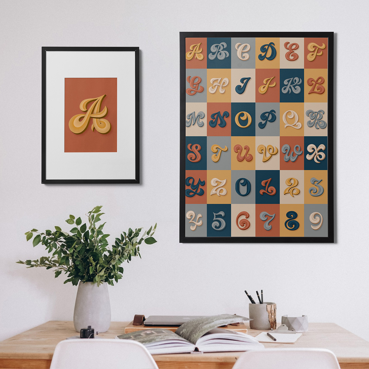
For my first foray into this 36 Days of Type challenge, I experimented with dimensionality and overlapping elements. I wanted the series to feel cohesive but for each letter to have it’s own personality. The continuous color palette establishes consistency but the different combinations promote variety. The subtle textures and shading incorporated throughout provide visual interest and dimensionality without distracting from the overall shape.
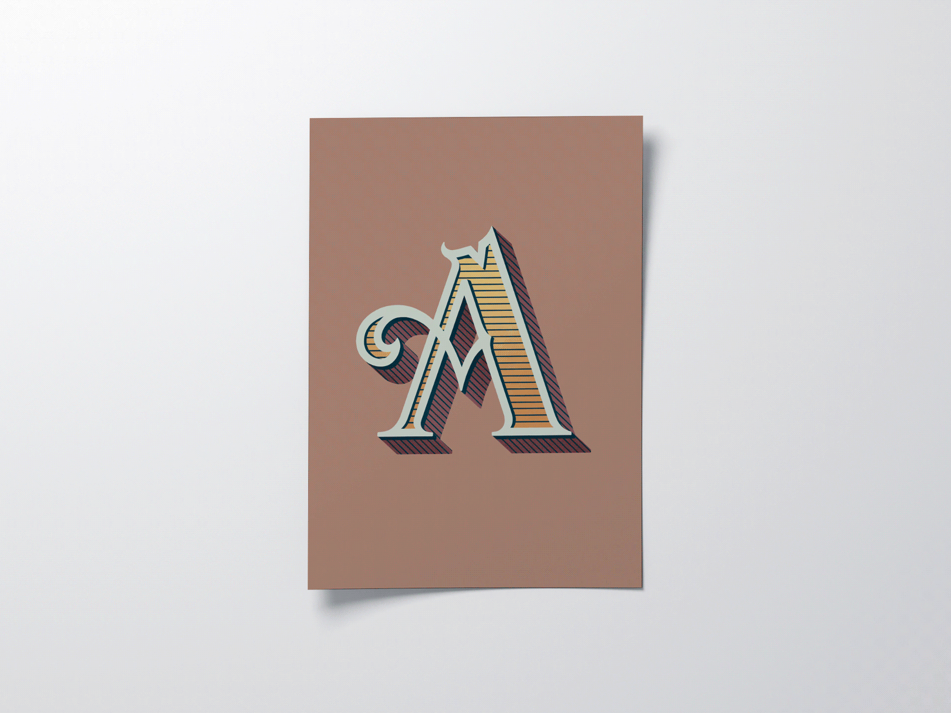
The second time around, I wanted to experiment with different letterforms with a unifying theme. I created a series inspired by vintage and retro typography. The letter stylings span the decades to show the evolution of design.
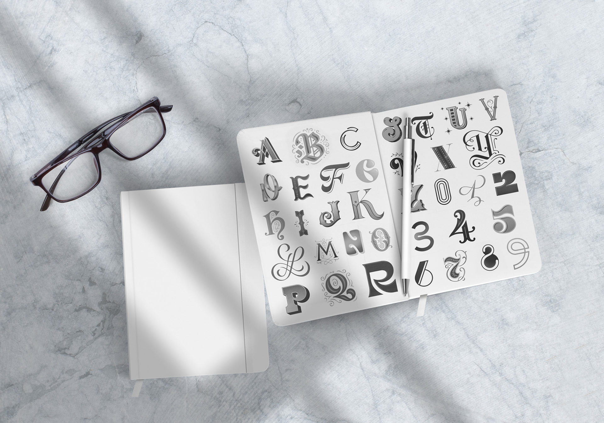
In many ways, focusing on a single letter can be more challenging than fleshing out an entire composition. This project was daunting but incredibly rewarding. I chose to mimic the letterforms that inspire me most; elegant yet bold, classic yet contemporary. For a deeper look, feel free to check out my other hand-lettering projects.