AEW
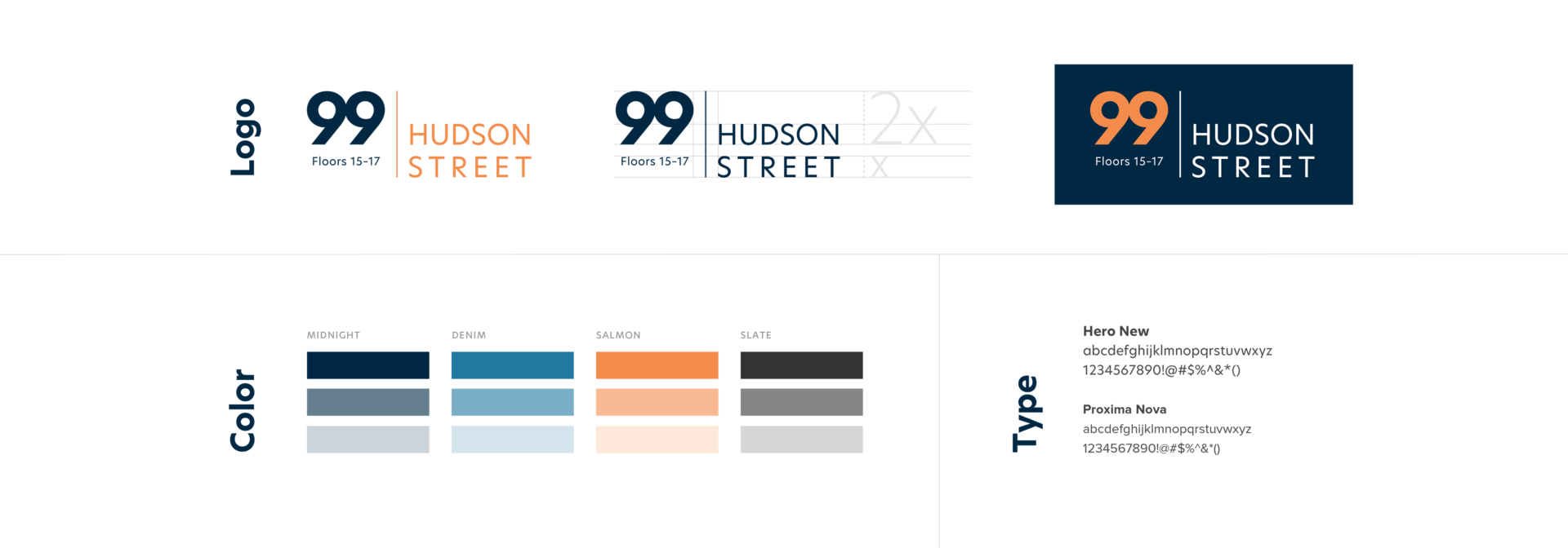
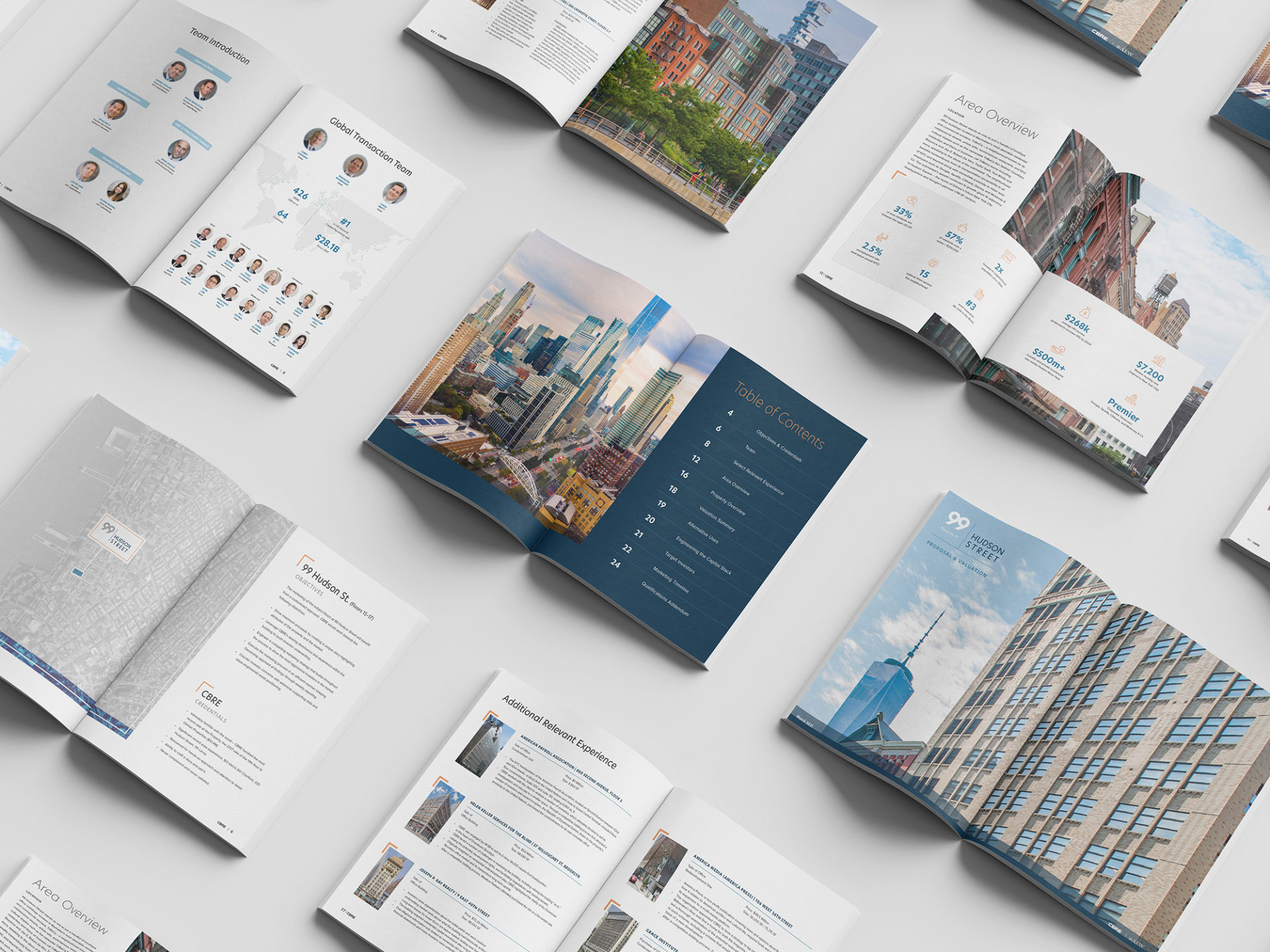
CBRE has a vast amount of experience in the New York market. The goal of this proposal was to showcase those credentials to AEW. Additionally, CBRE wished to educate the client on the benefits of a customized approach to market 99 Hudson. To develop this building’s identity, I took a lot of inspiration from the surrounding neighborhood of Downtown Manhattan. New York has many layers, old and new, that overlap. And especially Downtown, these layers are jam-packed. In any single view, a person can see a Beaux Arts building next to a modern sculpture, next to a park. This mishmash of colors and textures – concrete and brick and metal and glass – is one of the things that makes New York so special. Every snapshot is unique.
To illustrate this, I compressed the numbers within the building logo so that they fuse into a single shape. The geometric font calls attention to the variety of shapes that a person can see throughout the city. The strong vertical divider takes inspiration from the strong verticals of the building itself. And the framing devices used throughout the book are meant to highlight the depth and breadth of CBRE’s New York experience. The colors employed are meant to give the book a sense of gravitas while still providing vividness and clarity. And the sophistication of these elements correlate to the attention to detail that CBRE will provide for AEW.