Brewed Awakening
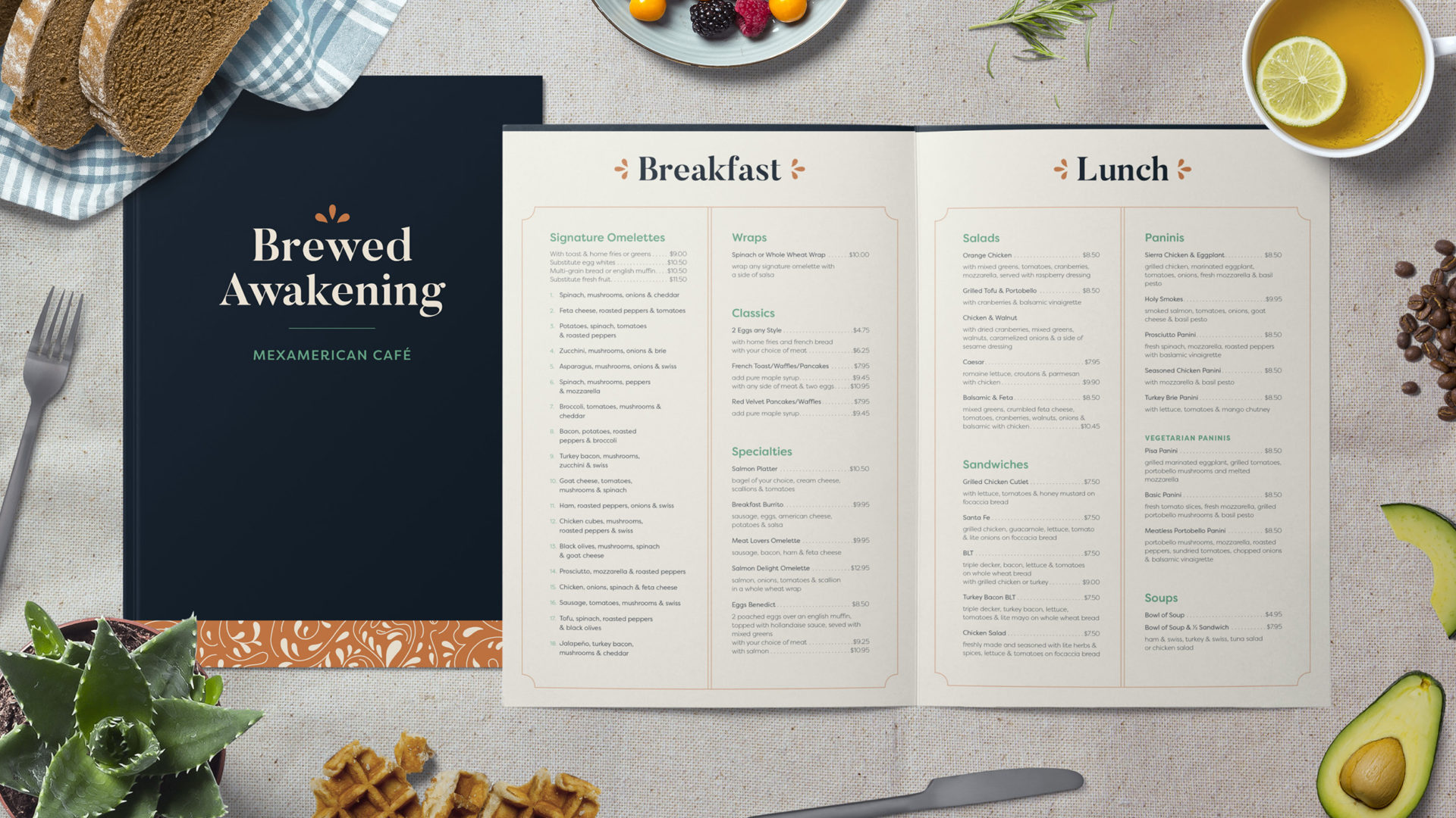
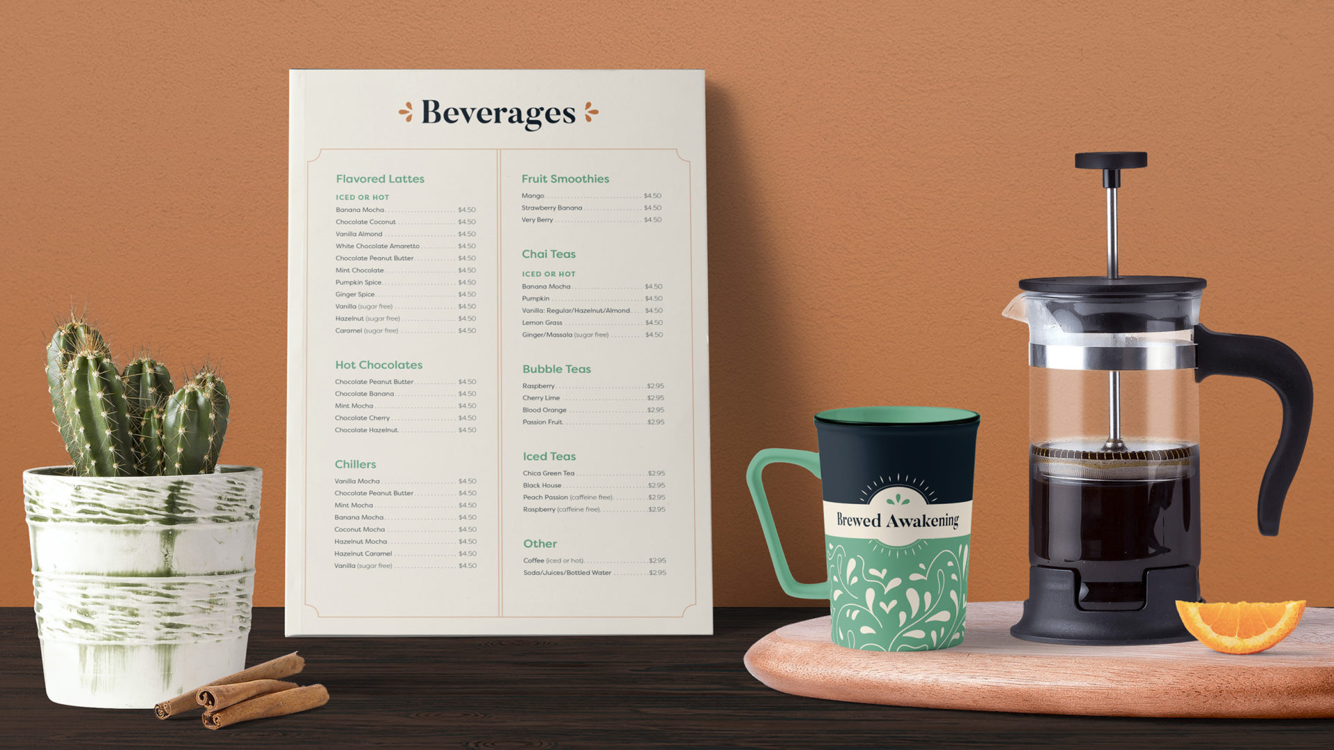
Brewed Awakening is a neighborhood café located in Metuchen, NJ serving both Mexican and American brunch cuisine. The goal with this redesign was to subtly incorporate the Mexican aesthetic and polish the brand while still maintaining its relatability. This restaurant already had a colorful personality and loyal customer base, and I wanted to stay true to that.
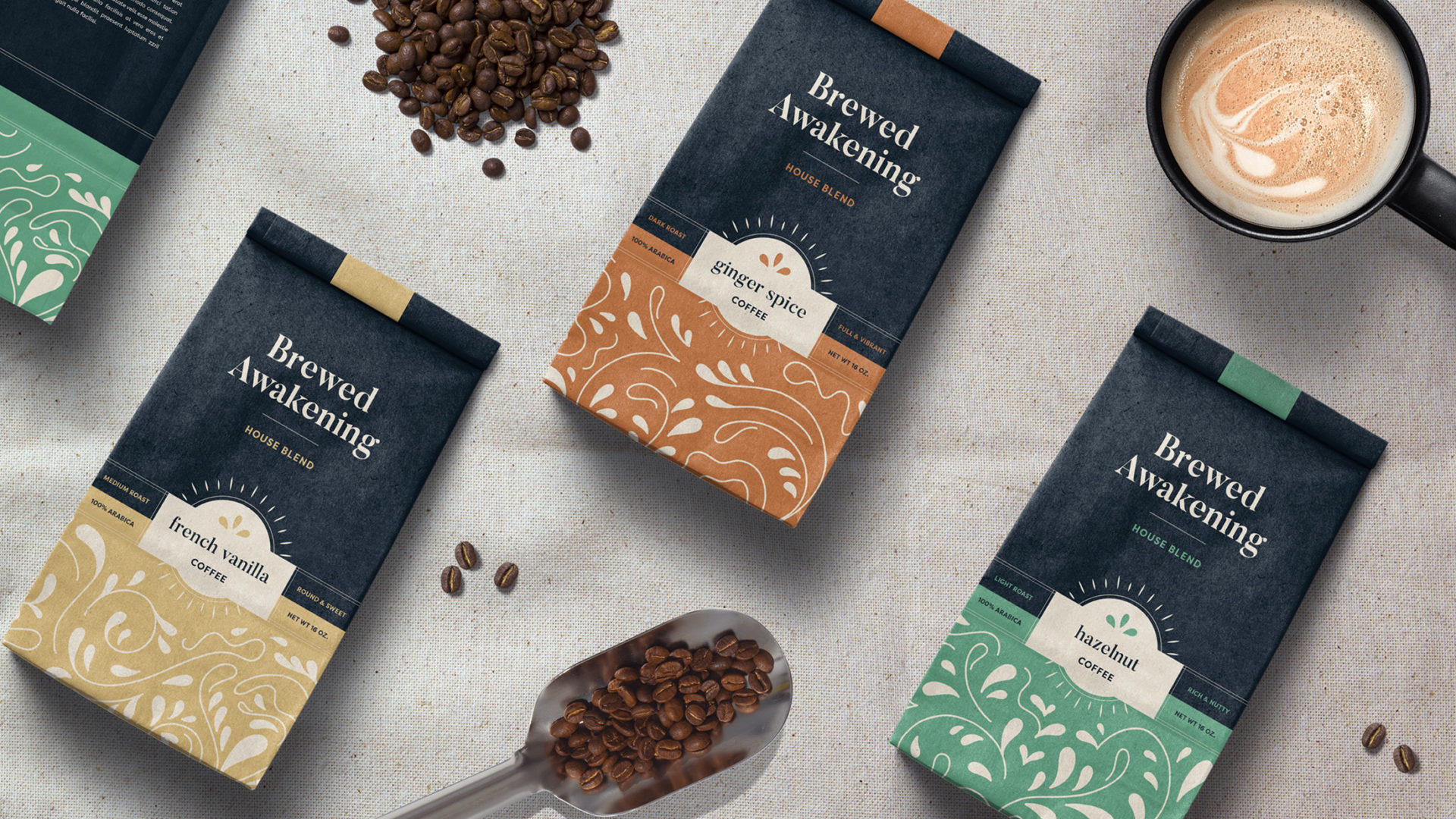
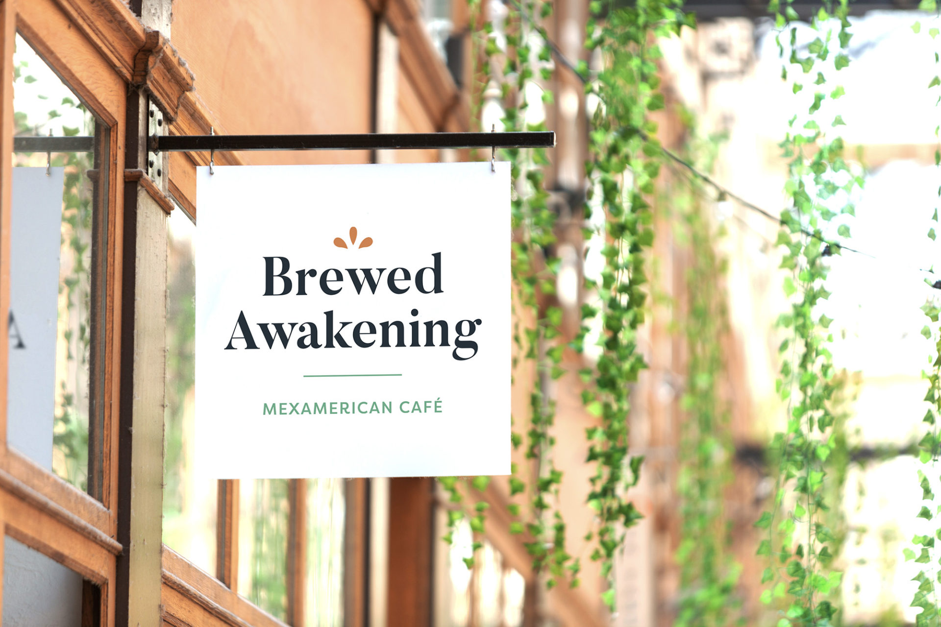
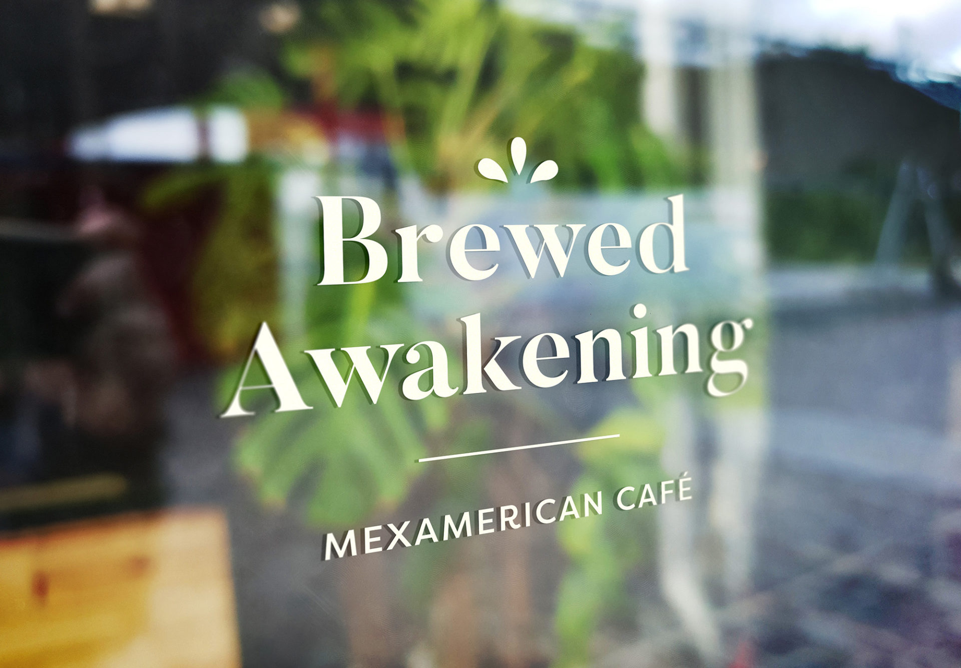
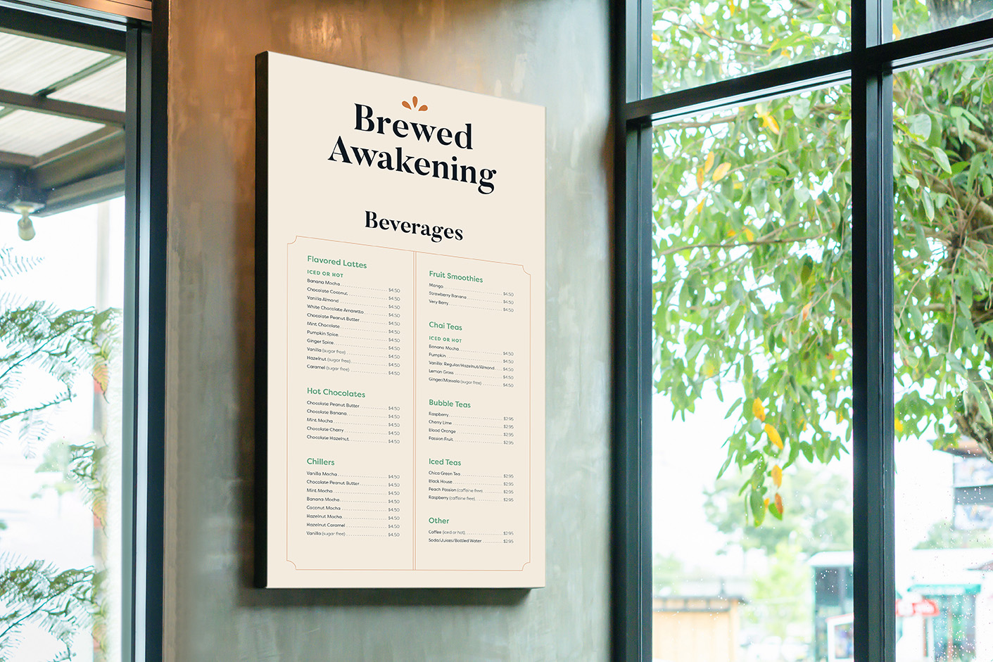
My strategy was to celebrate Brewed Awakening’s distinct personality with a vibrant color palette, a friendly wedge serif, and approachable illustrated patterns. First and foremost, I began with the logo. I chose a font that would pair well with the various illustrative elements. Because they are rather curvy, I chose a geometric wedge serif with high contrast. In certain instances, the logo also includes a tagline to describe the fare offered at Brewed Awakening.
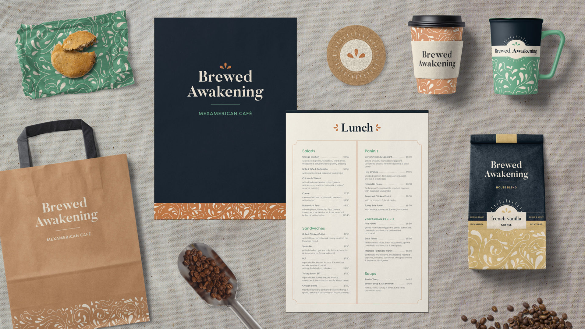
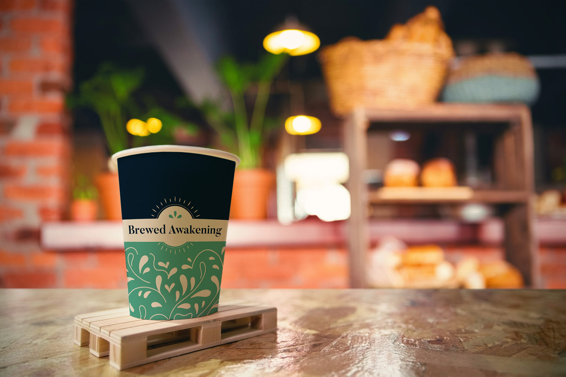
The packaging further expands this identity by incorporating a sunburst. This serves as a visual manifestation of the word Awakening. The pattern below then elaborates by incorporating illustrated swirls and tear drops. These shapes were inspired by the milky patterns seen in coffee mugs. The pattern in the packaging is visible in many to-go items as well. The Brewed Awakening collateral system expanded to include mugs, hot cups, napkins, coasters, and paper bags.