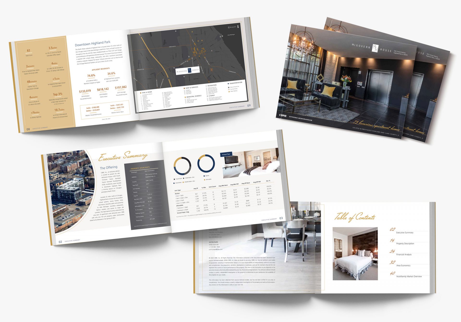
CBRE Chicago
In order to market this luxury apartment building in the heart of Highland Park, a suburb of Chicago, CBRE wanted an elegant and upscale offering memorandum. For this printed piece, my first idea in order to connote elegance was to employ a simple but captivating script font for the section headers. Inspired by the Art Deco style, I chose to use a minimal color palette with high contrast and neutral tones along with bold geometrical shapes. I wanted to incorporate the existing blue of the McGovern logo into the color palette. In addition to this, I added a pop of gold paired with beiges and grays. Instead of the typical iconography to represent statistics, I chose a simple text treatment. This not only reduced the whimsicality but it also increased the luxurious aesthetic.
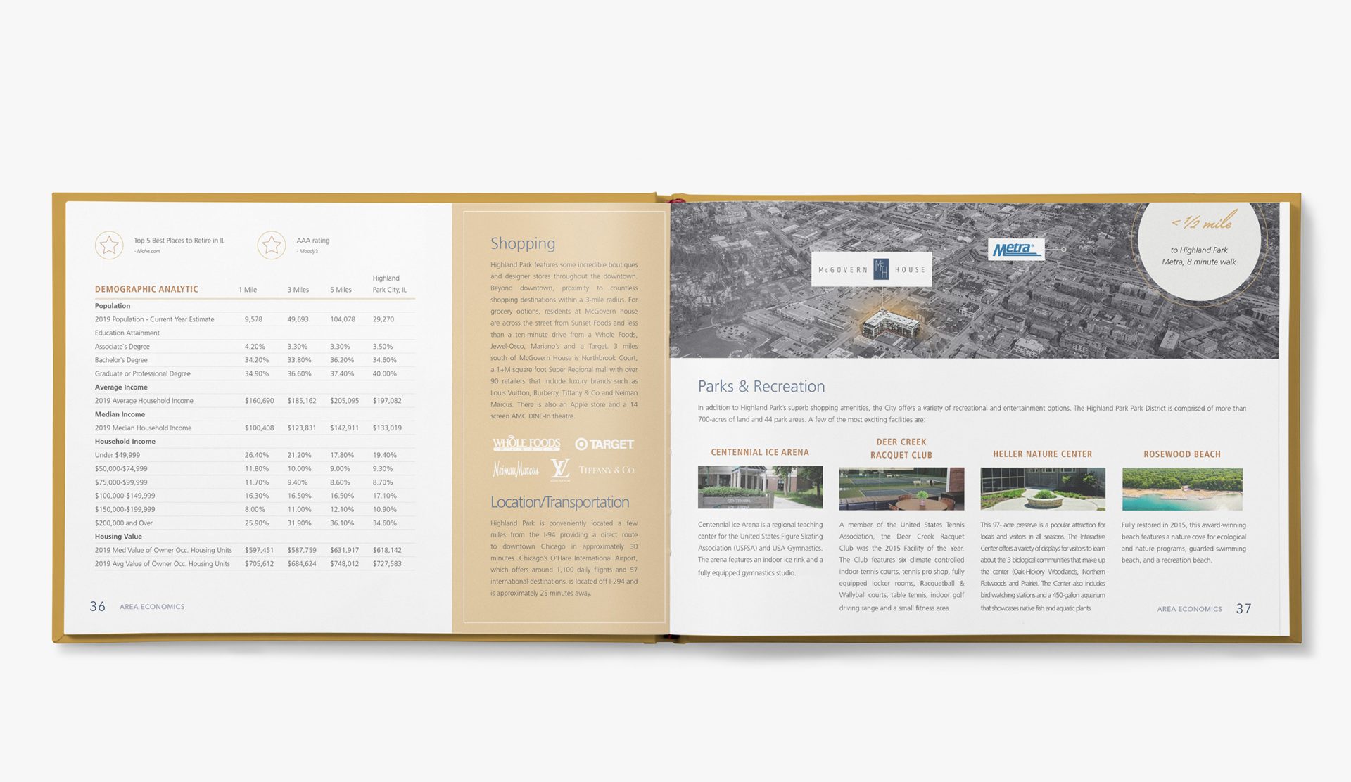
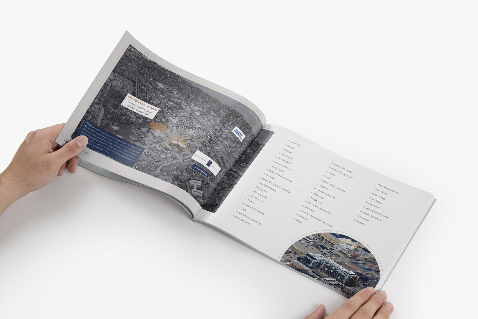
Both the CBRE maps and aerials are stylized to be sleek and dark; the highlighted elements glowing the McGovern gold. This high contrast exists not only with color, but also with scale. The body text is slightly smaller than normal with narrow columns and justified against circular shapes to give it a very high-fashion feel. In contrast, the section headers are significantly larger and bolder. To further this upscale appearance, I employed thin linear elements throughout the book. This gave the photos a more delicate feel. Last but not least, negative space was key in giving this CBRE offering memorandum a luxurious and elegant aesthetic.