CBRE New York
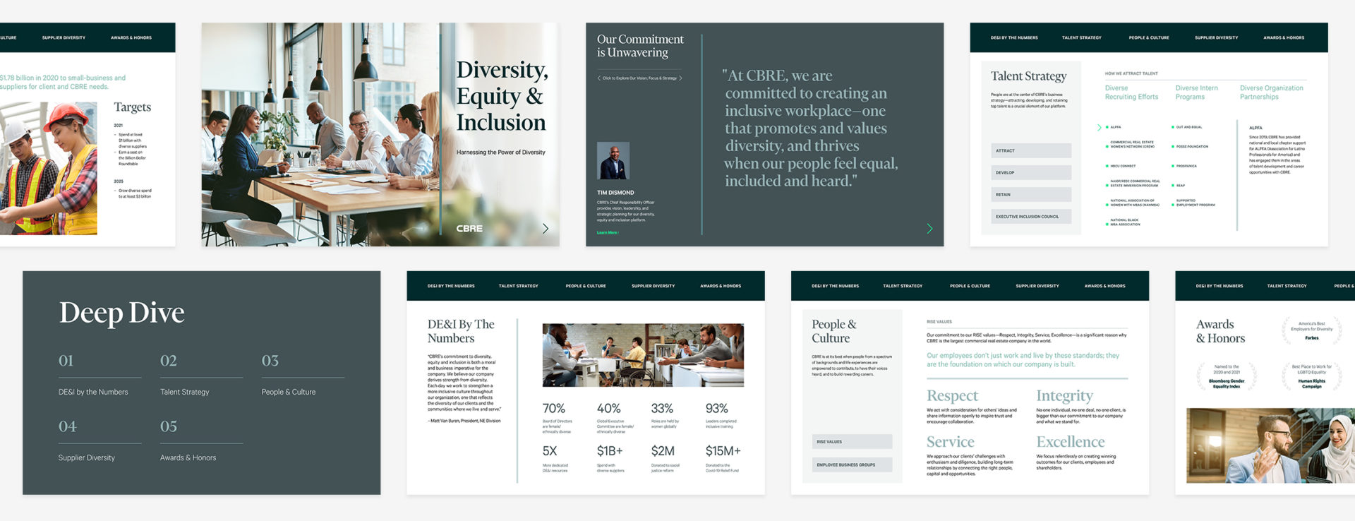
Adobe Publish Online provides a unique opportunity for the audience to interact with content in a much more engaging way. CBRE wanted their Diversity Equity and Inclusion information to be as user-friendly and inclusive as possible. Because of this, Publish Online was the best tool for the job. The goal of this presentation was to allow the user to navigate on their own through the material so that they can click on whatever interests them and toggle easily between pages. It was also important not to inundate them with too much information at once. I chose to divide the content into easily digestible chunks. The user was then free to reveal those pieces at their own discretion.
I also chose to complement this information with bold and powerful imagery. Because the new CBRE brand dictates a more elegant and minimal approach, I strove to reflect this within the design. And because diversity is the central point of this deck, I made sure that the imagery showcased a range of ethnicities, religions, and disabilities.
Animation was another key component to this presentation. I wanted there to be continuous movement on every page to keep the user engaged. However, I did not want them to be sitting there watching a show. I employed CBRE’s new “line of sight” brand element and had that load in several directions and ratios on each page. In this way, I was able to keep this digital deck varied and dynamic but consistent.
