Cushman & Wakefield
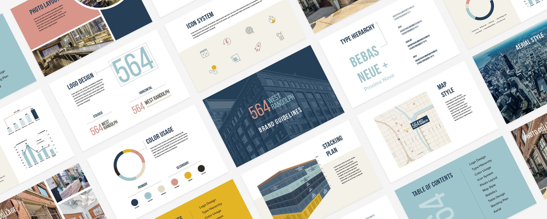
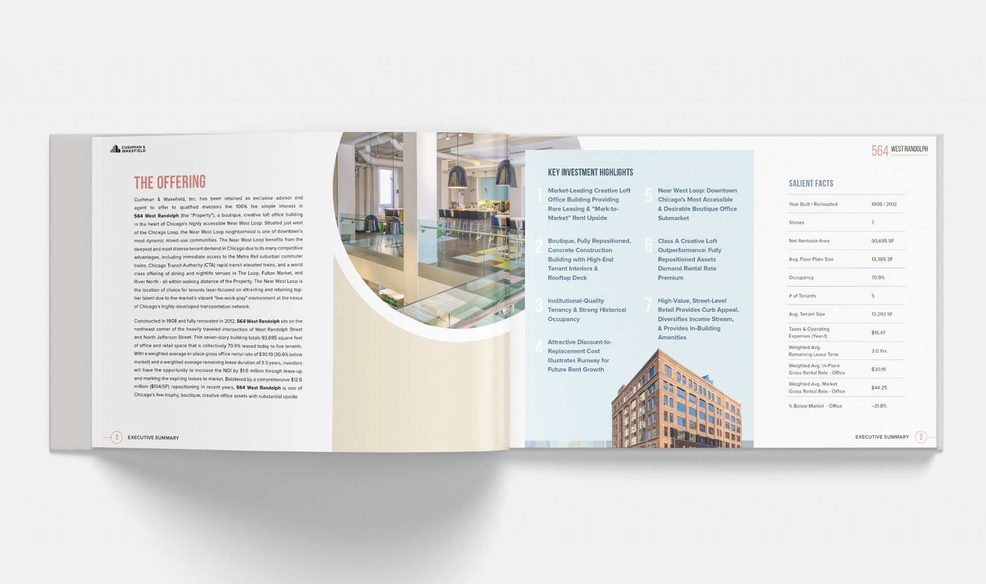
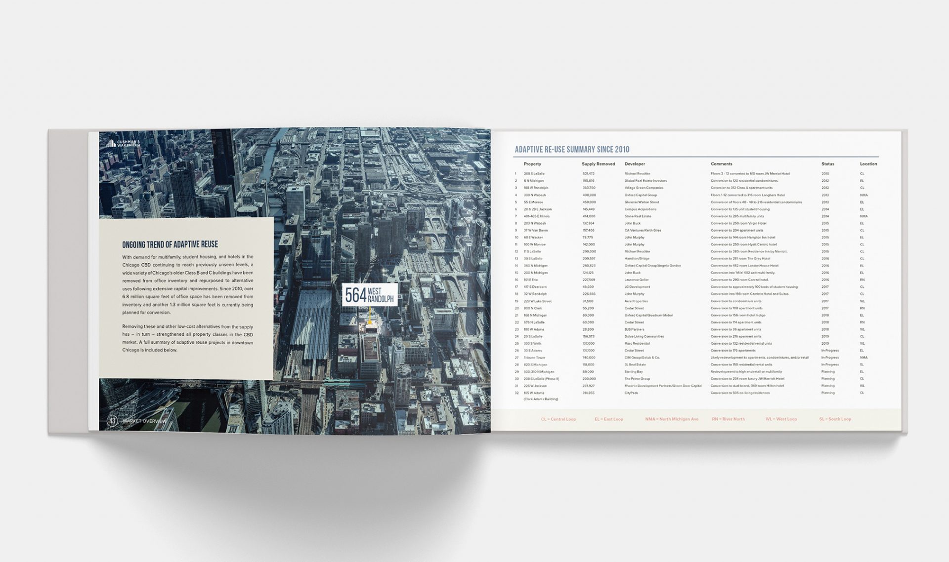
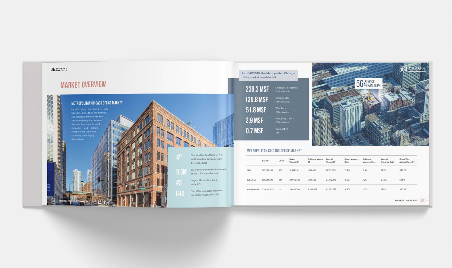
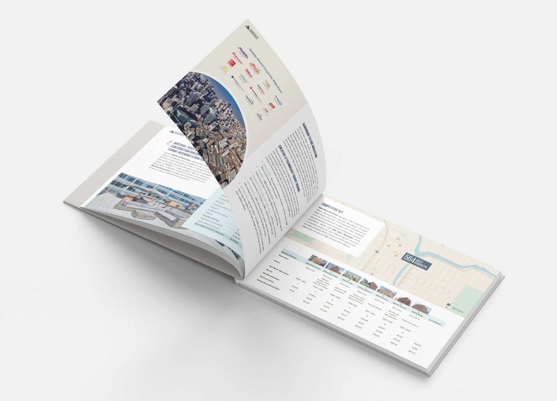
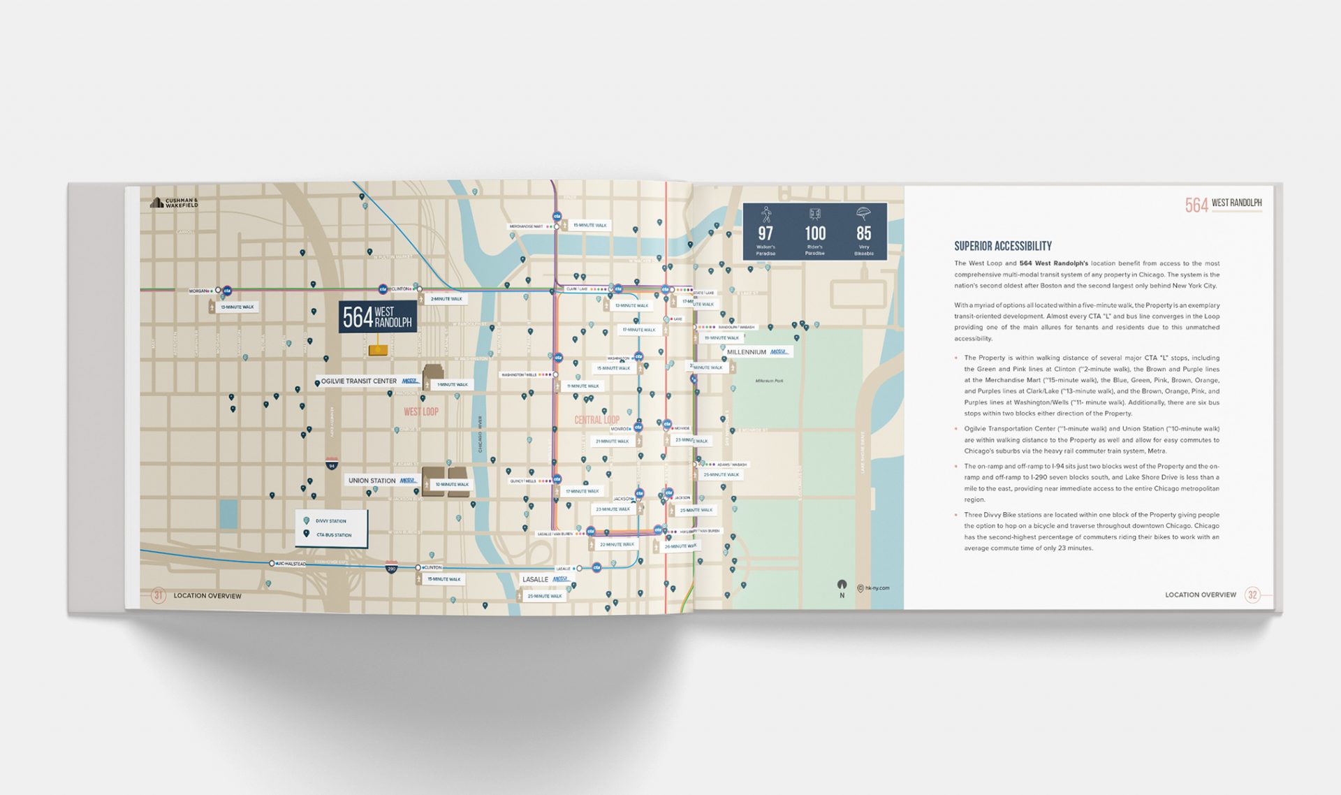
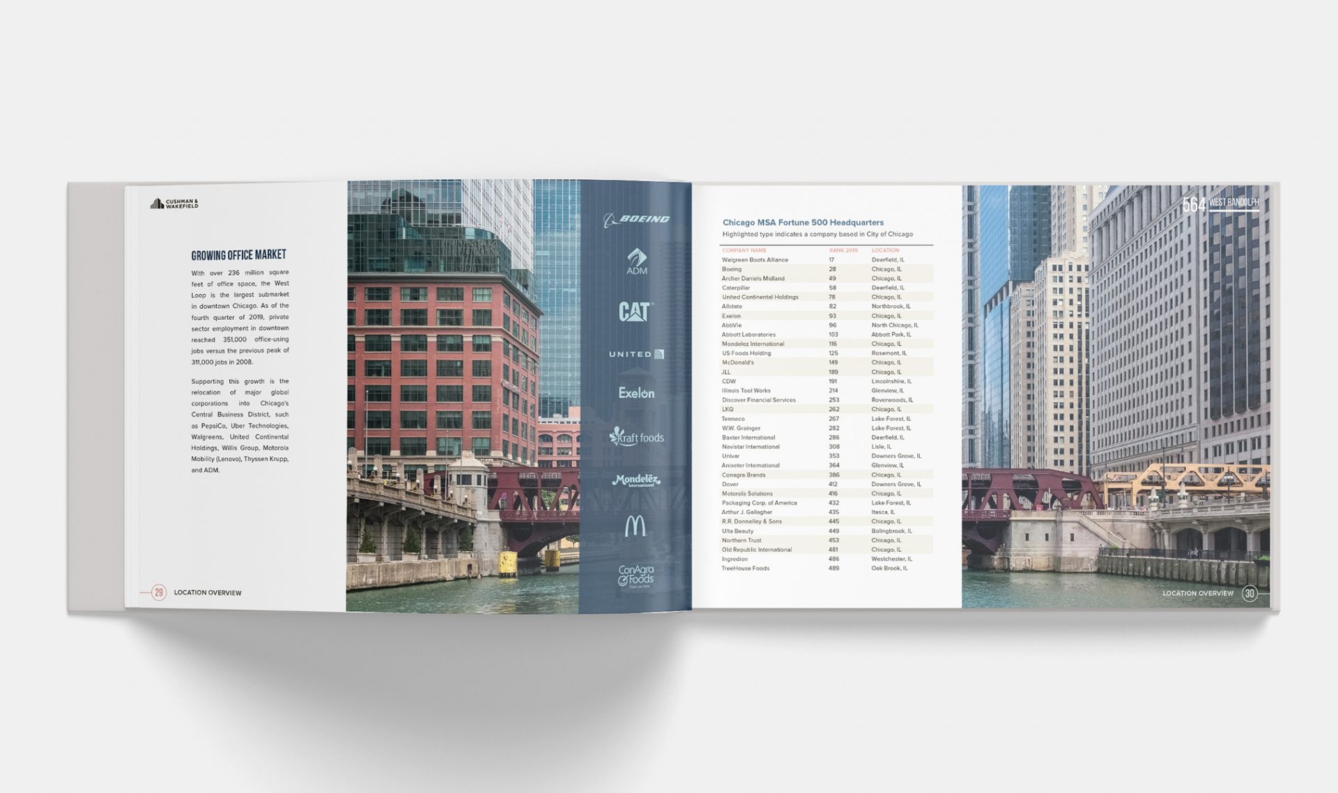
For this Chicago-based building, Cushman & Wakefield requested a bold design for the 564 West Randolph offering memorandum. My main challenge with this book, as with every print design, was to establish a color palette, typographic hierarchy, and layout that would support the diverse content without overwhelming or distracting from it. One key strategy was to spread out the information and allow the imagery to shine. They wanted to anchor the building in the Chicago Central Business District while also highlighting the property’s amenities. The book features several aerials to showcase the property’s proximity to major Chicago attractions. Likewise, I included maps to showcase its proximity to major transportation hubs. I also chose to incorporate: financials, infographics, charts, tables, statistics, iconography, floor plans, and stacking plans.
The client had a very specific vision in terms of how they wanted this property information to be laid out and it was my job to make that vision a reality. Cushman and Wakefield has a very broad and successful portfolio. This book needed to live up to their reputation and also stand apart from their other properties. Because the facade is a bit plain, this meant using bold shapes and bright colors to liven it up.