Eataly
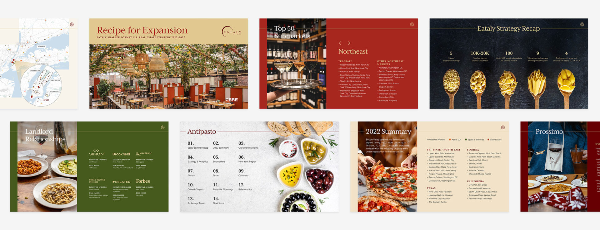
The mission of Eataly is to gather high-quality food at sustainable and reasonable prices, to celebrate Italian biodiversity, and to create an informal, natural, and simple place to eat, shop, and learn — all under one roof. The goal of this deck is to help Eataly review retail expansion opportunities across the U.S. With fairly dense content, I chose to use Publish Online to consolidate the information.
Because Eataly is all about experience, I wanted this deck to fit with its vibe. With high-end package design and mouth-watering food, Eataly is certainly a celebration of Italian cuisine. Likewise, this deck needed to reflect that. I therefore employed colors taken straight from Italian dishes; pasta, marinara, and basil. I also wanted this presentation to fit the client exceedingly well, so I made sure to pair the content with their photography as much as possible.
The headlines on each page are meant to be elegant, versatile, and minimal. This is to reflect the exquisite package designs found in Eataly stores. The page layouts fluctuate between split content and full bleed imagery to create a dynamic yet consistent feel.
With interactivity and animation, minimalism is key. The animation in this deck is meant to be subtle. Most of what animates on the page are the interactive elements so that the user is prompted to click through. The pizza pie in the top right corner of each page allows the user to click back through to the Table of Contents, thereby enabling them to navigate the deck with ease.
