Hart House
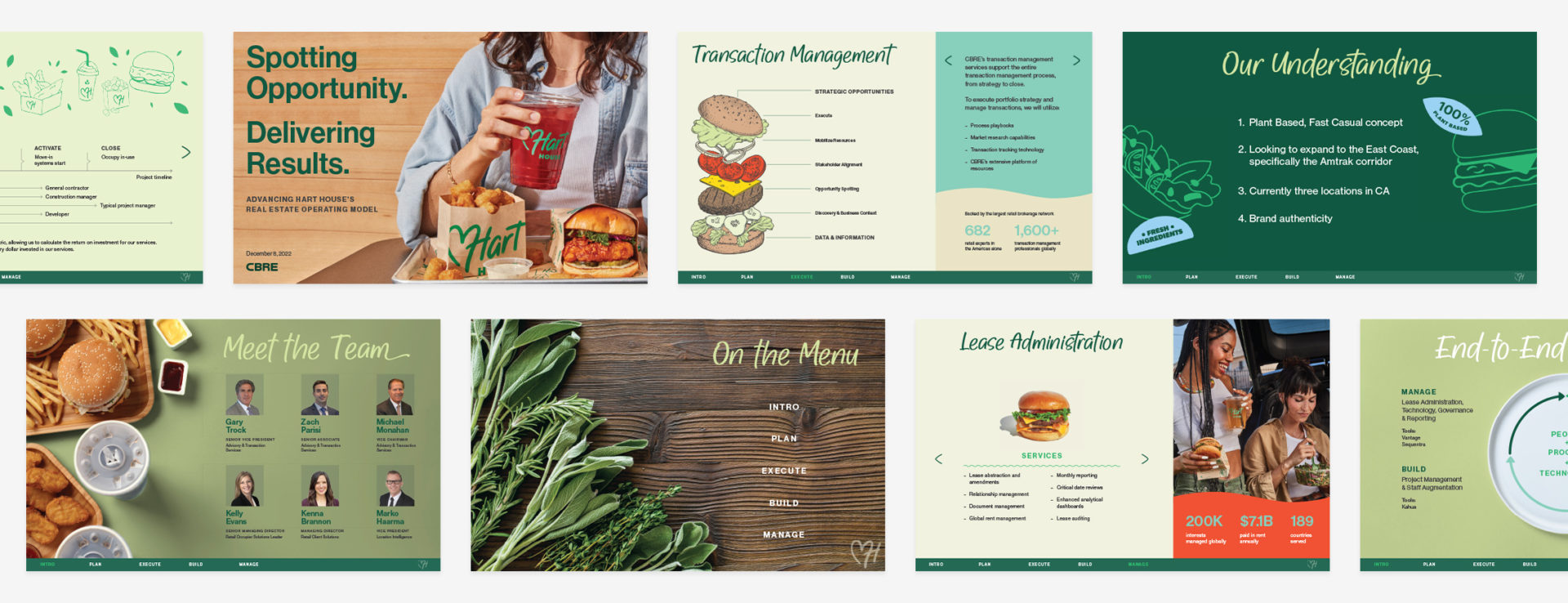
Hart House is Kevin Hart’s plant-based fast food franchise. The goal of this deck was to help them review retail expansion opportunities on the East Coast. The content was fairly dense whereas the brand is fun. I therefore employed Adobe Publish Online to consolidate and animate the necessary information.
The mission of Hart House is to serve delicious and sustainable food. As such, their brand uses organic shapes, bright colors, and funky illustrations. To pair this with the corporate material being presented, I utilized the brand’s photography, illustration style and color palette whenever possible.
As with any animation, my goal was to supplement the informational hierarchy as opposed to distracting the audience. I strategically chose which content to highlight with movement so as to draw in the user’s eye. Likewise, I chose to only animate one or two elements per page.
In order to keep the presentation dynamic, I assigned a basic grid structure but then switched up the background colors and informational layout. In this way, the deck is consistent yet flexible.
This deck also features a navigation bar and home button at the bottom of each page. This way, a person can flip between sections easily. By making this deck easy to navigate with digestible and dynamic information, I was able to make a typically very corporate presentation much more fun for the client.
