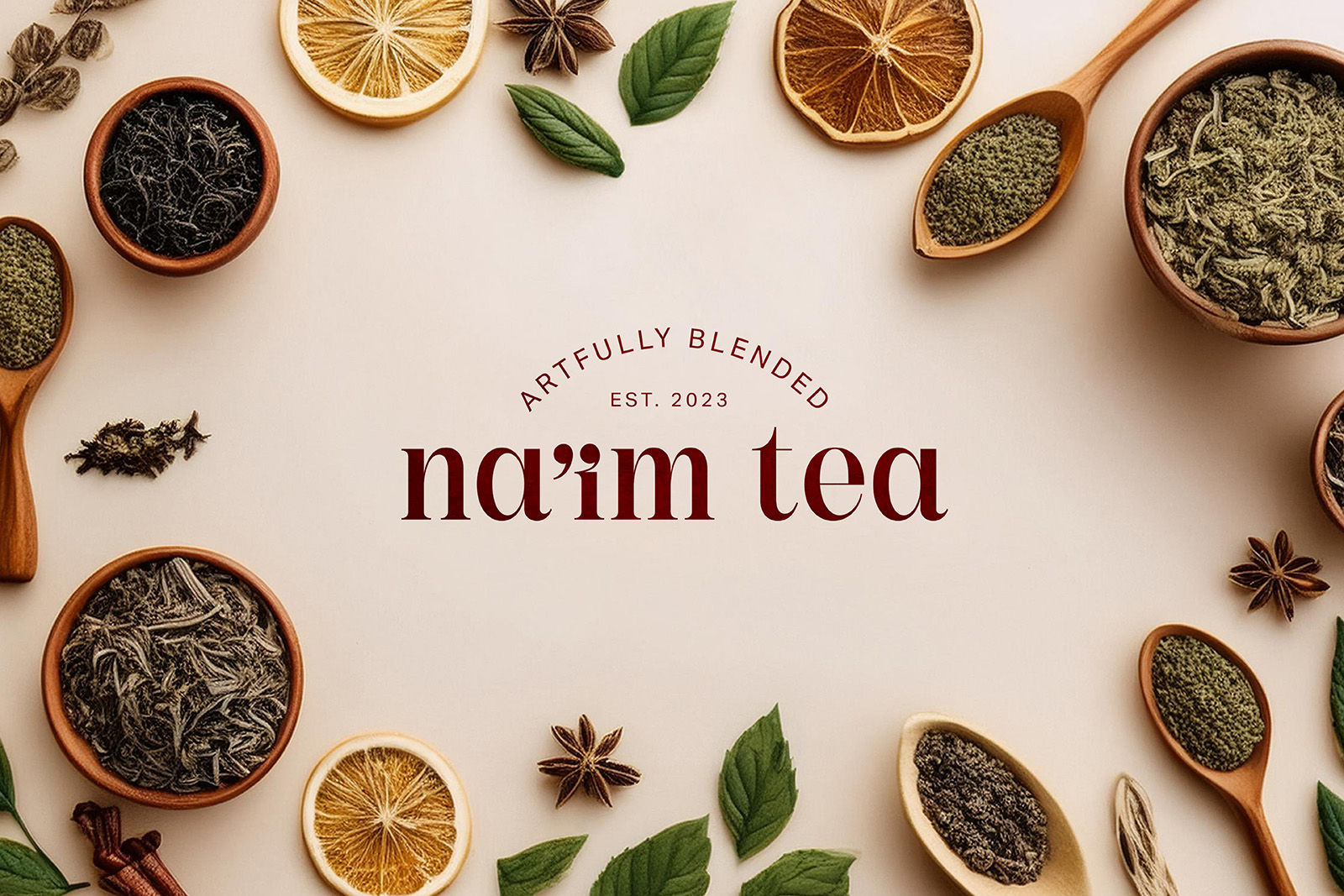
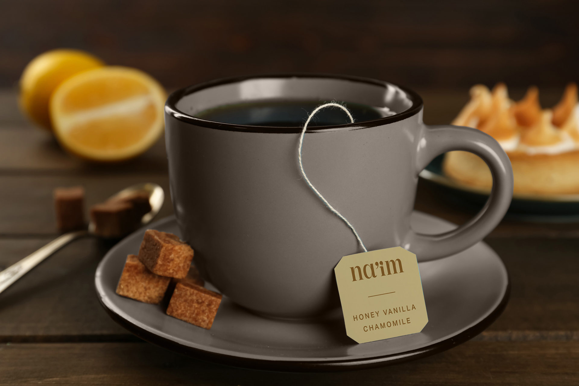
Na’im Tea
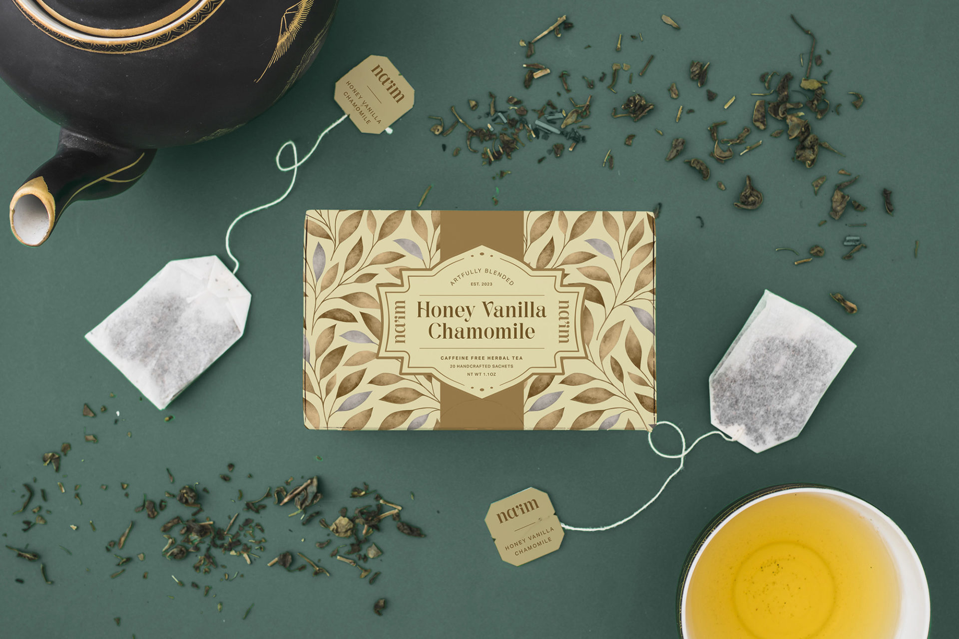
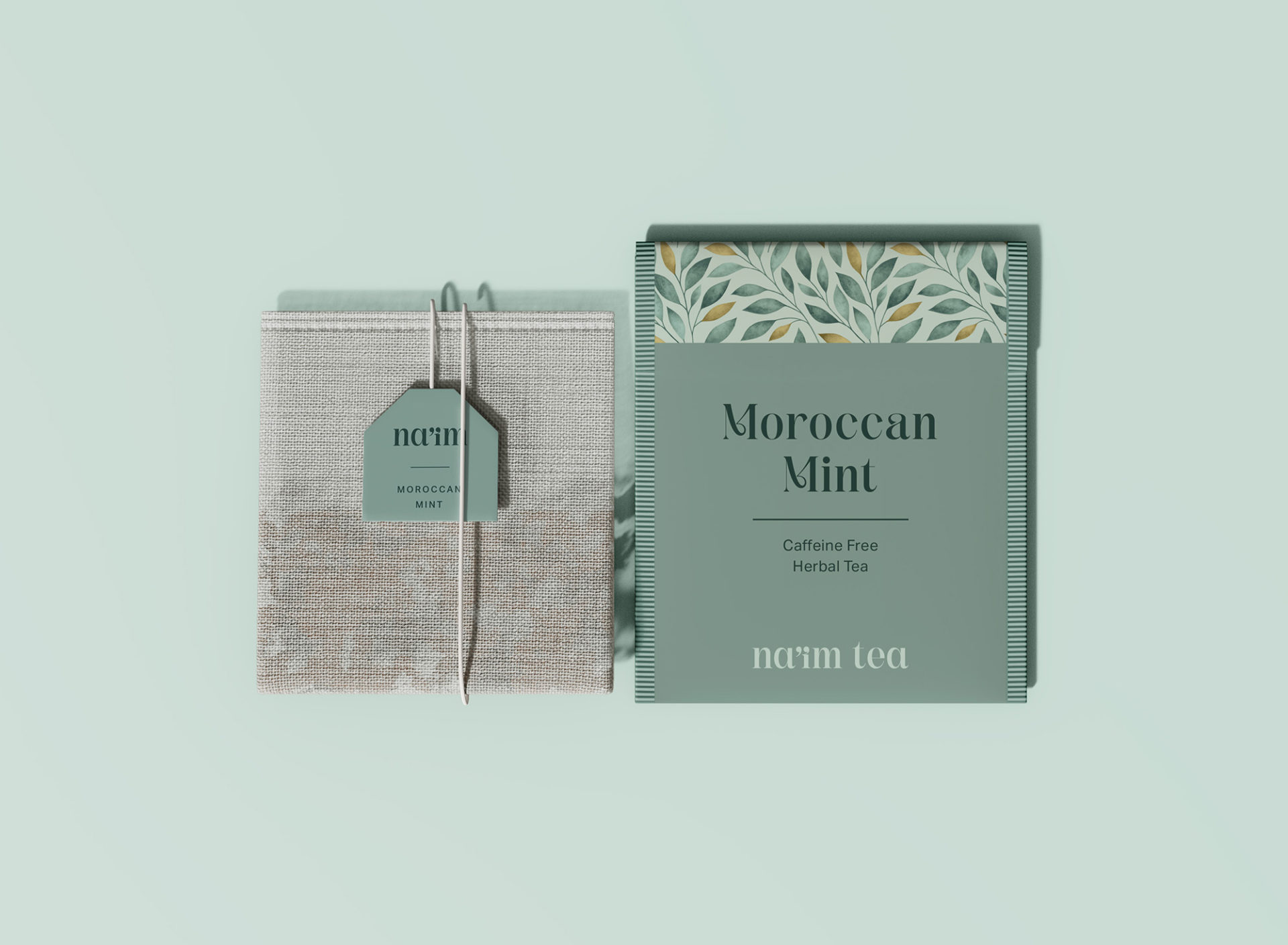
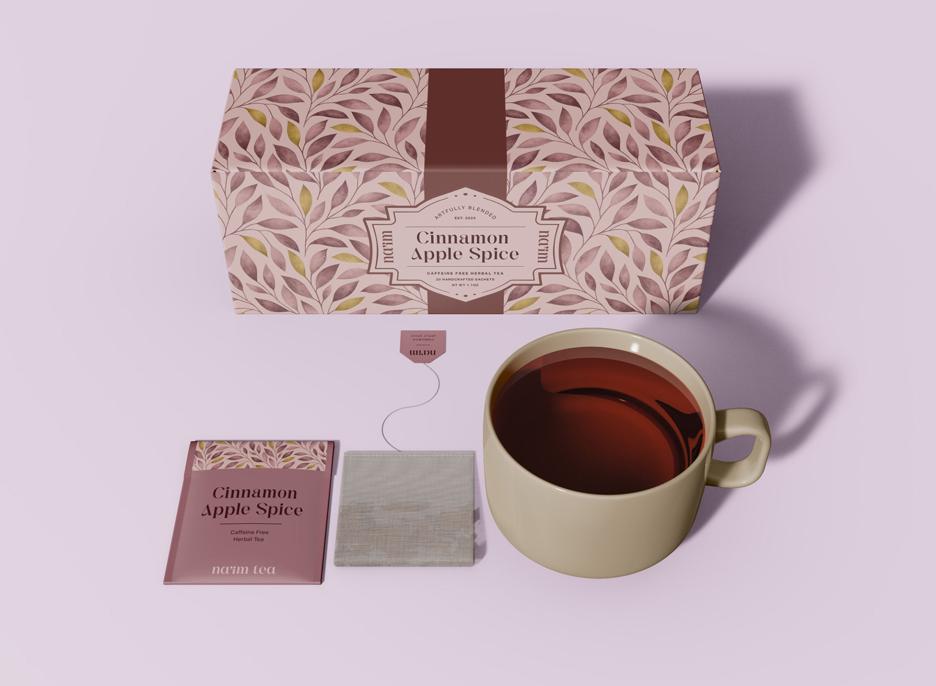
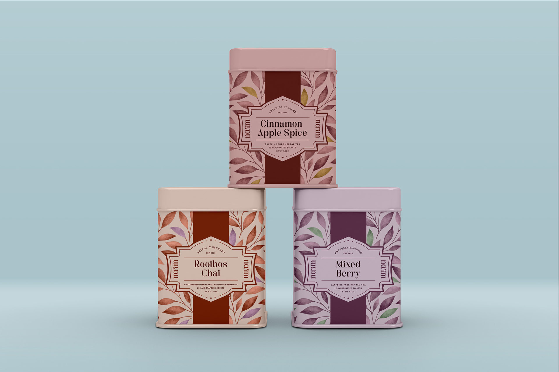
Everything about this tea brand is meant to evoke tranquility and serenity. From the flowing pattern on the box to the stacked stones on the tea bag, I strove to incorporate a sense of peace and softness. At the end of the day, drinking tea is an experience. It’s about how it makes you feel. It soothes your vocal chords and softens your throat, warms your hands and clears your sinuses. Moreover, it is both clarifying and hypnotic. And this brand emulates that experience.
Na’im in Hebrew means pleasant. It is for this reason that this brand and packaging utilizes organic shapes, soft lines and earthy colors. The flavors featured in Na’im directly inspired the color palette. For the pattern on the box, I incorporated a subtle leaf motif to reference the essence of all tea – leaves.
For this project, I was heavily inspired by the work of Harney and Sons. It was this brand that first showed me that packaging can be beautiful and unique. Furthermore, Harney and Sons showed me how to elevate a fixture in everyday life. I truly enjoy this product and could think of no better way to pay homage to such a restorative pillar.