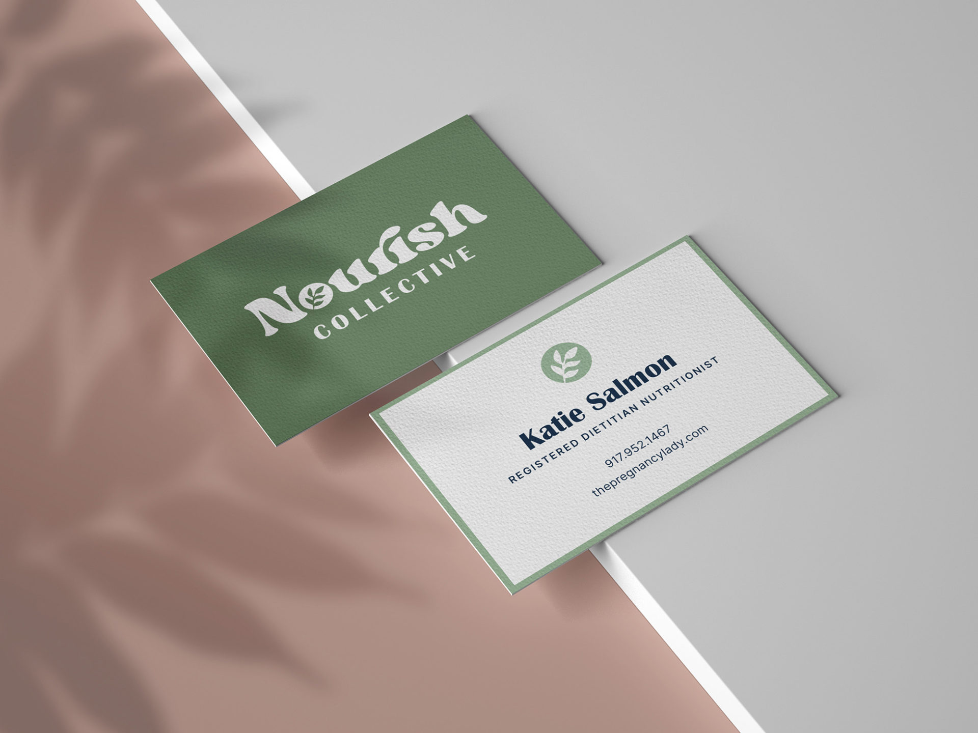
Nourish Collective
This client, a Registered Dietitian and Nutritionist, wanted to create a brand to support her budding independent nutrition practice, Nourish Collective. She requested a logo that would be playful, natural, and welcoming. I chose this typeface due to its fullness and softness – it fully embodies the concept of nourishment. I chose to incorporate a leaf within this logo mark to represent blooming, blossoming, and flourishing. Additionally, a leaf is attached to countless fruits, vegetables, and herbs. This leaf also acts as an individual element on branding materials and as an icon on digital media.
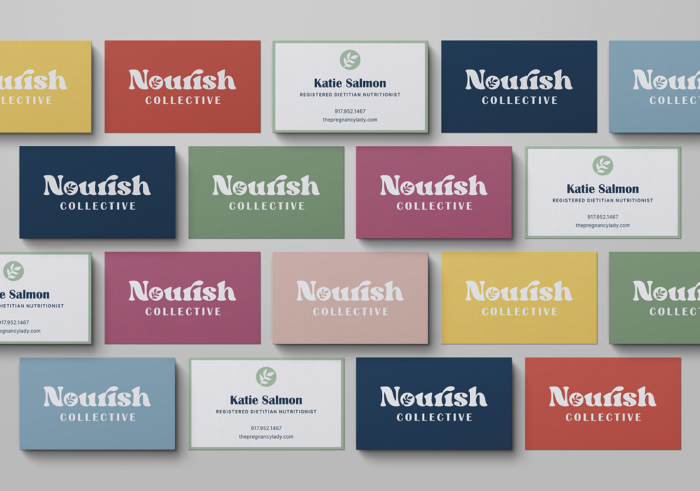
After illustrating a pattern of healthy foods, I pulled the color palette from the foods themselves to further ground them in a natural aesthetic. Such foods included: lemons, tomatoes, avocados, blueberries, onions, and asparagus. These colors are used to brighten up her business cards. With so many different varieties, this shows the client that they will receive an individualized and custom experience.
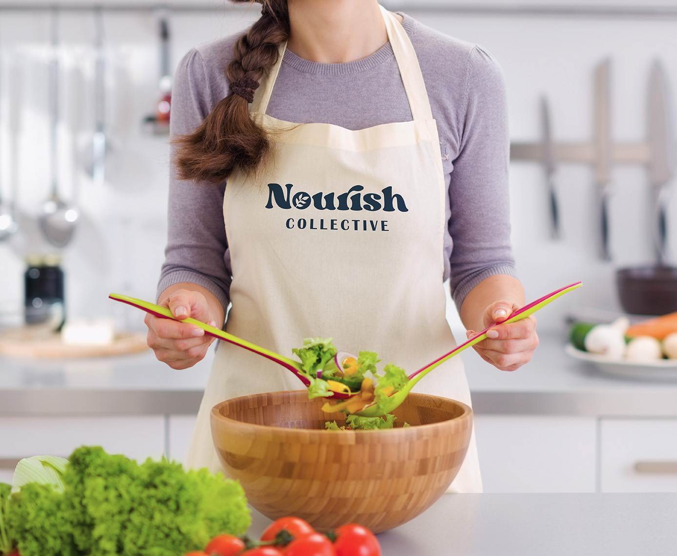
In addition to her instagram account and business cards, the client requested other collateral to support her marketing efforts. Items used to nourish the body seemed the obvious fit. For this reason, I developed designs for grocery tote bags, water bottles, mugs, and aprons. The mugs and water bottles both include a separate phrase “sip sip hooray”. This was chosen for its cheerful tone of voice. The client wanted her brand not to be too judgmental or stuffy, but rather to support and encourage her clients in their nutrition journey. The sipping implies a gradual effort to success; the hooray implies that her clients will have someone cheering them on in their corner.