Sketchbook Adventures
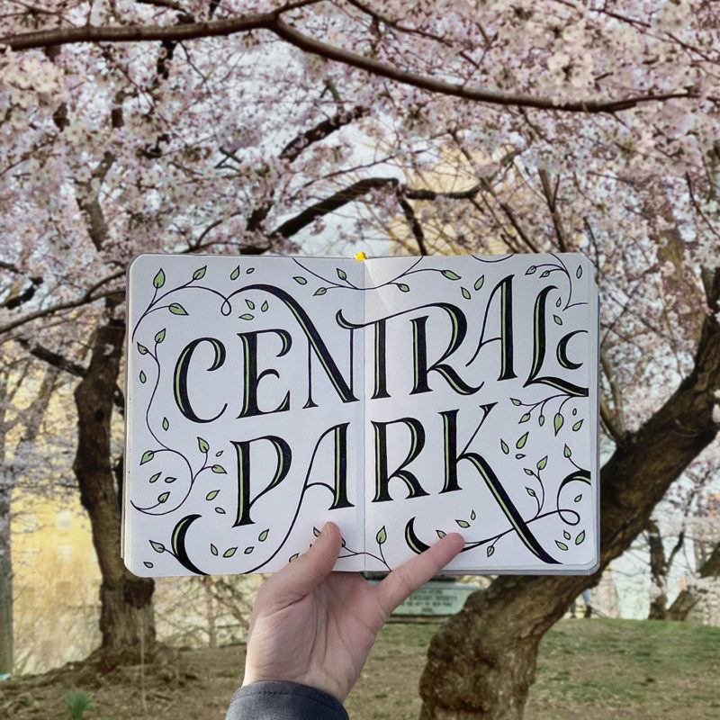
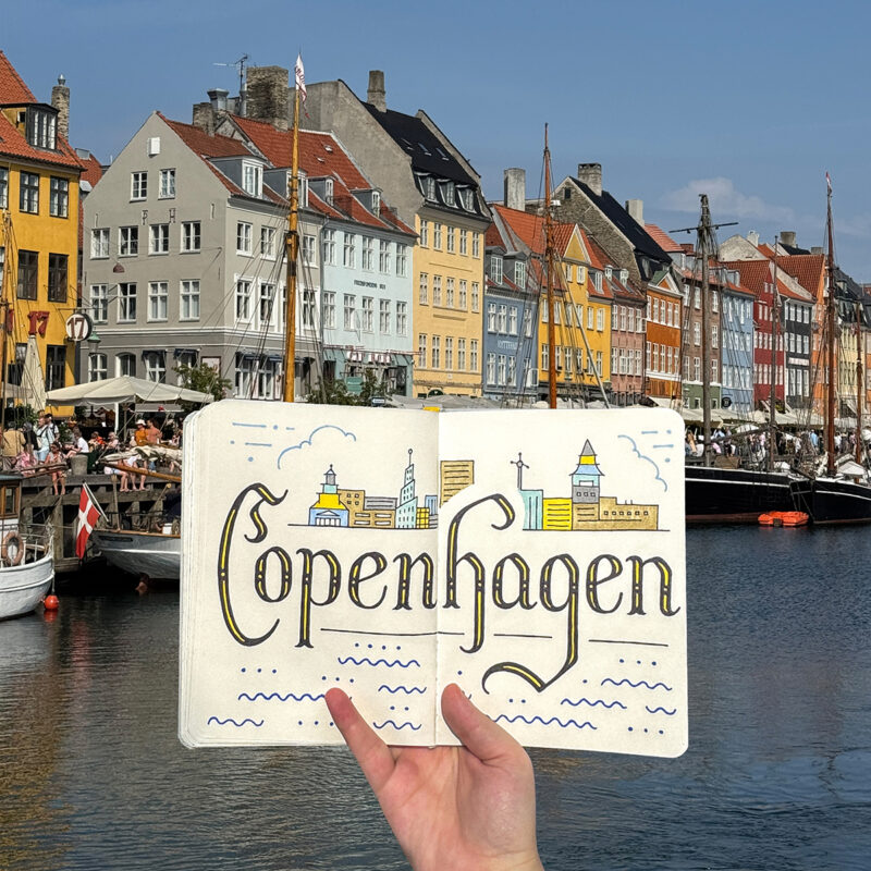
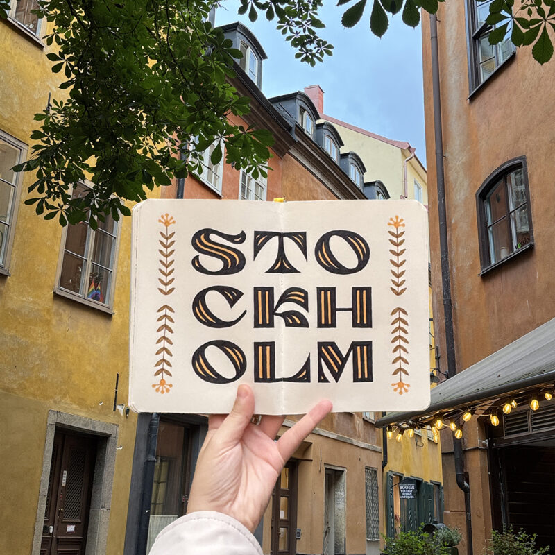
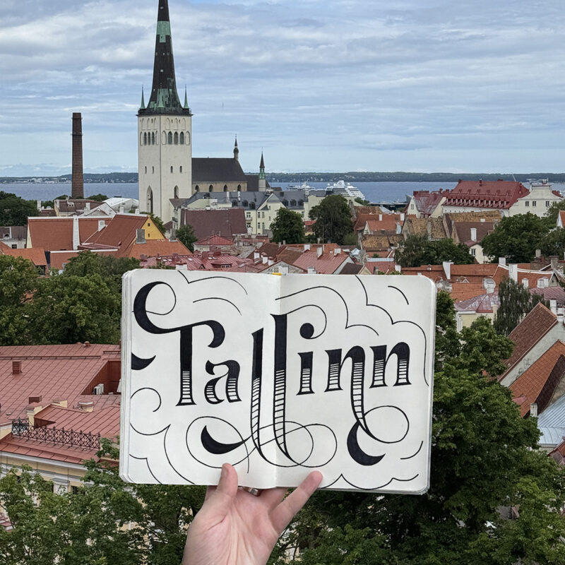
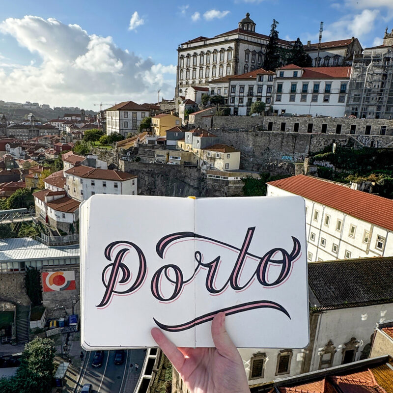
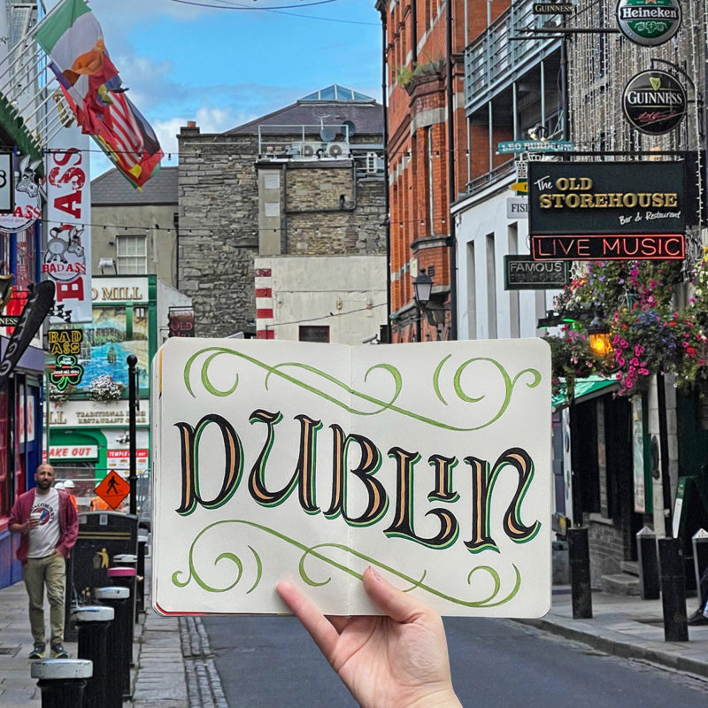
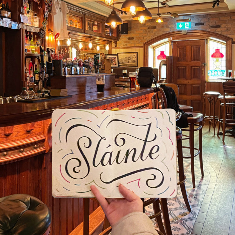
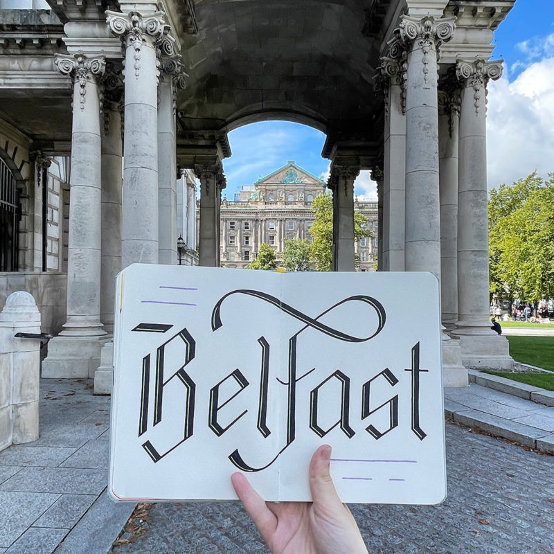
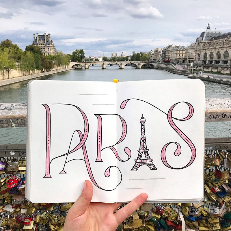
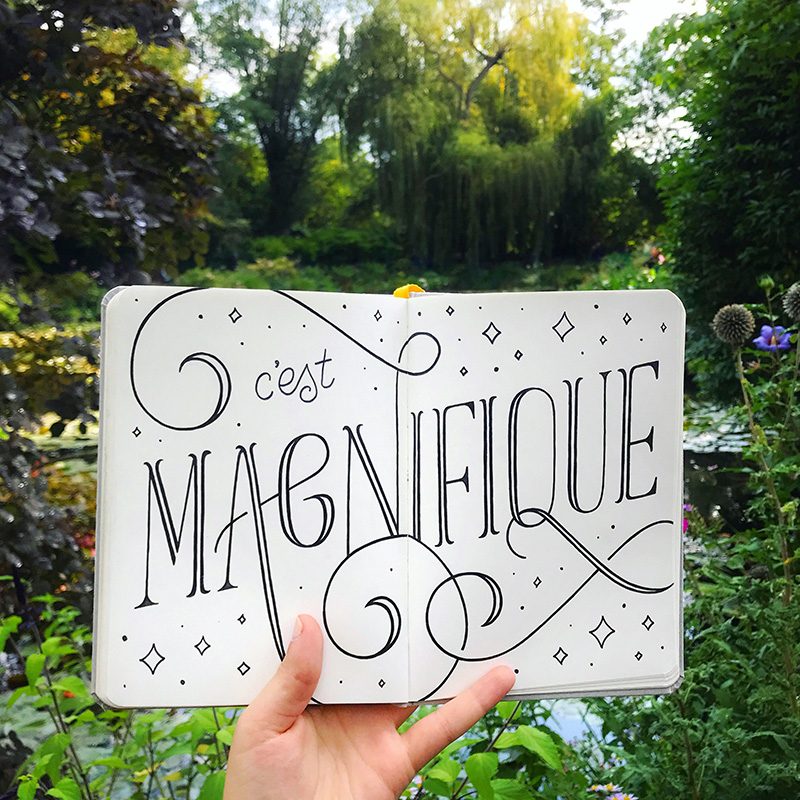
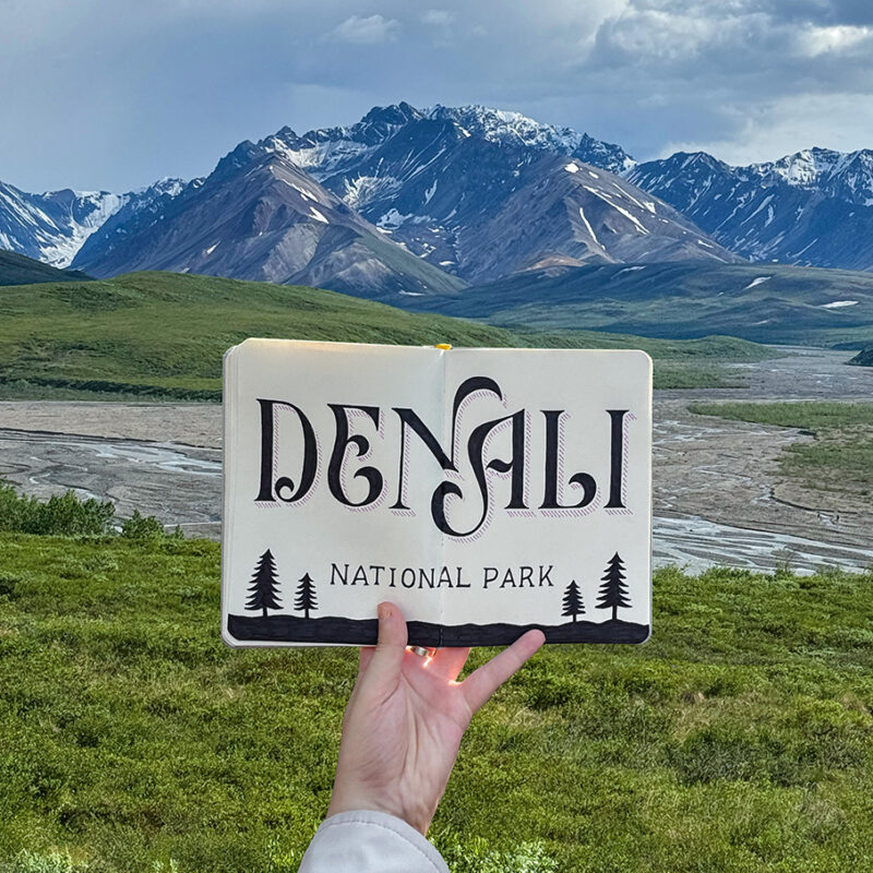
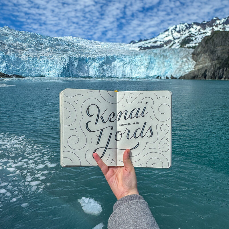
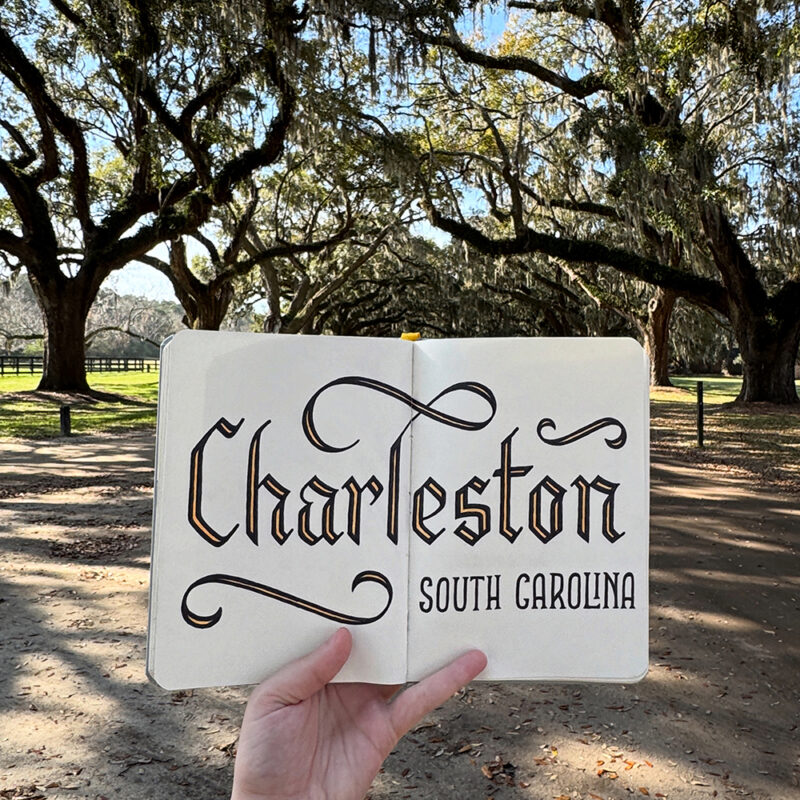
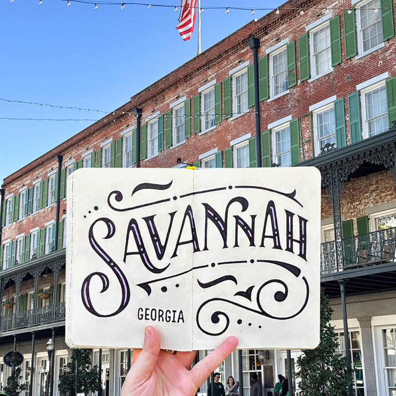
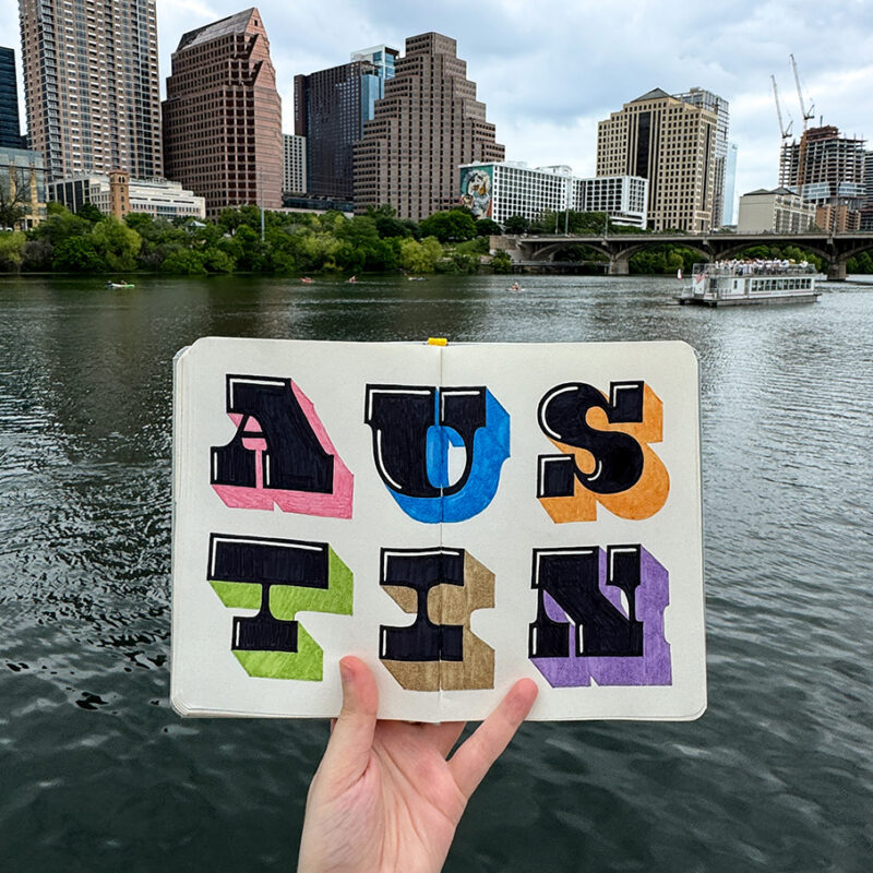
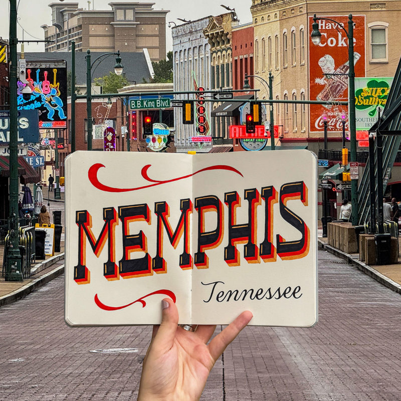
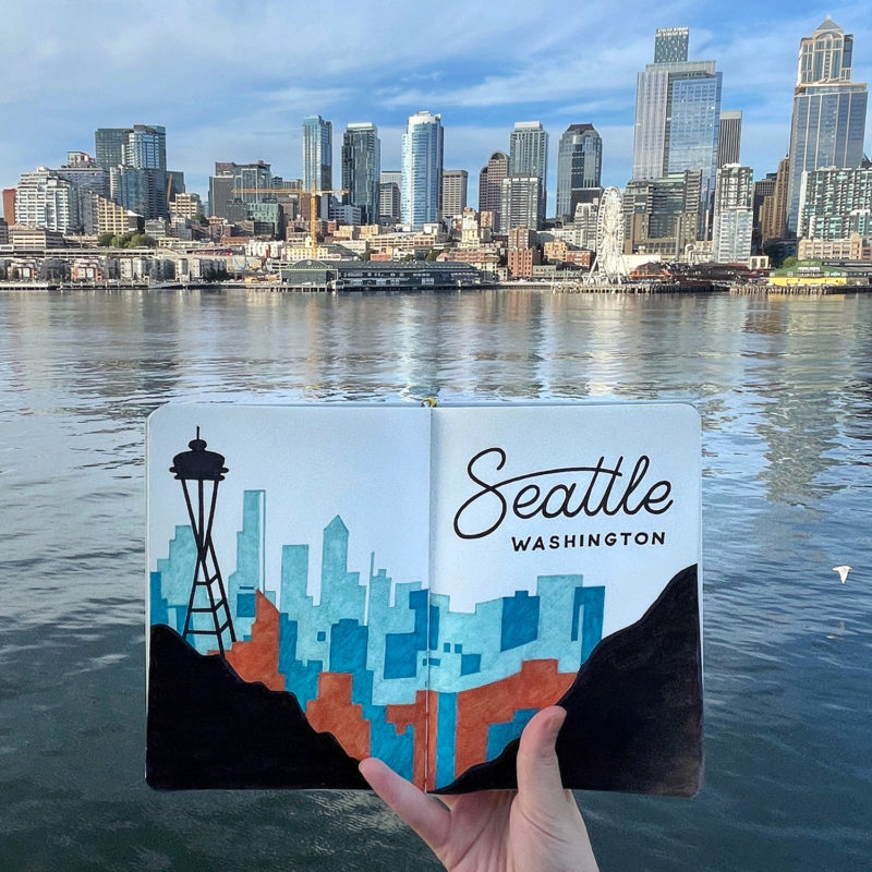
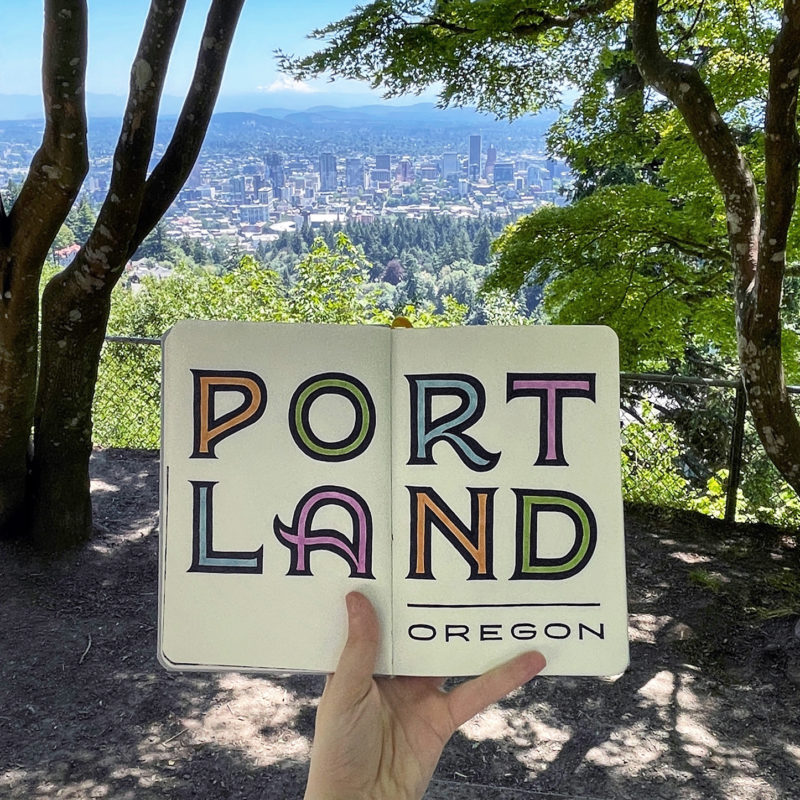
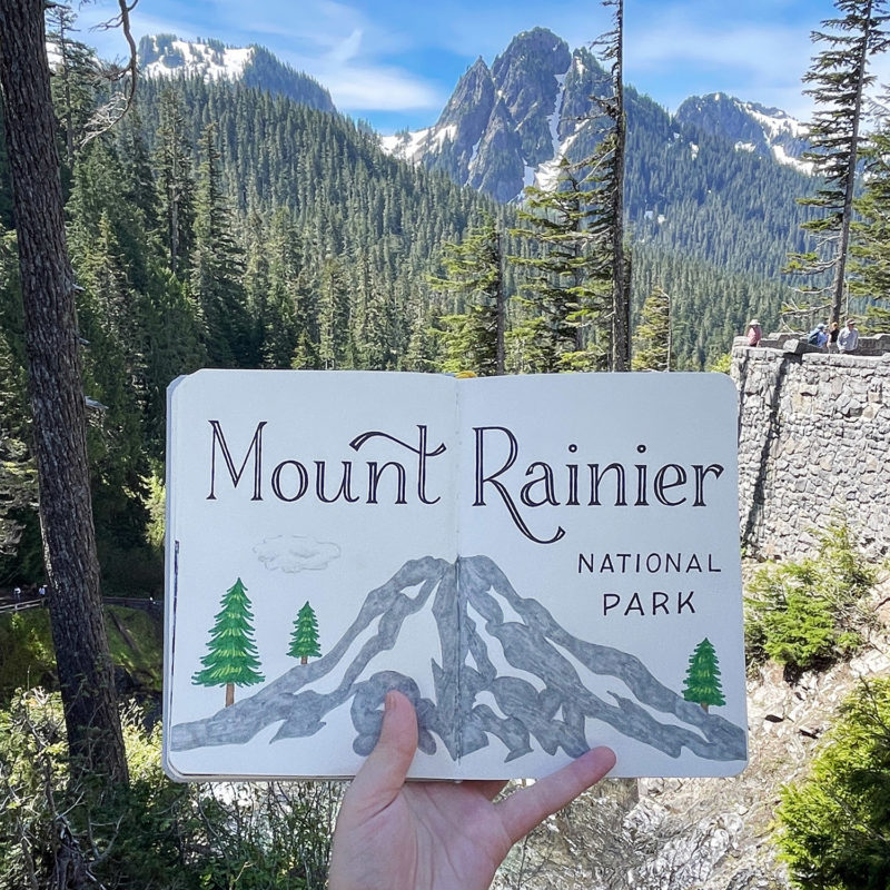
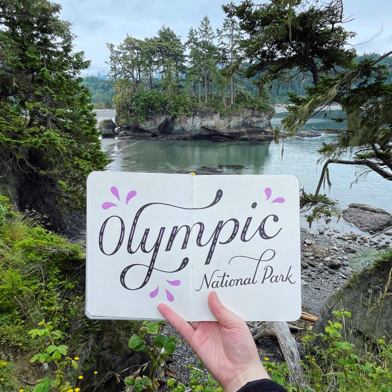
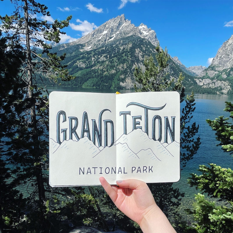
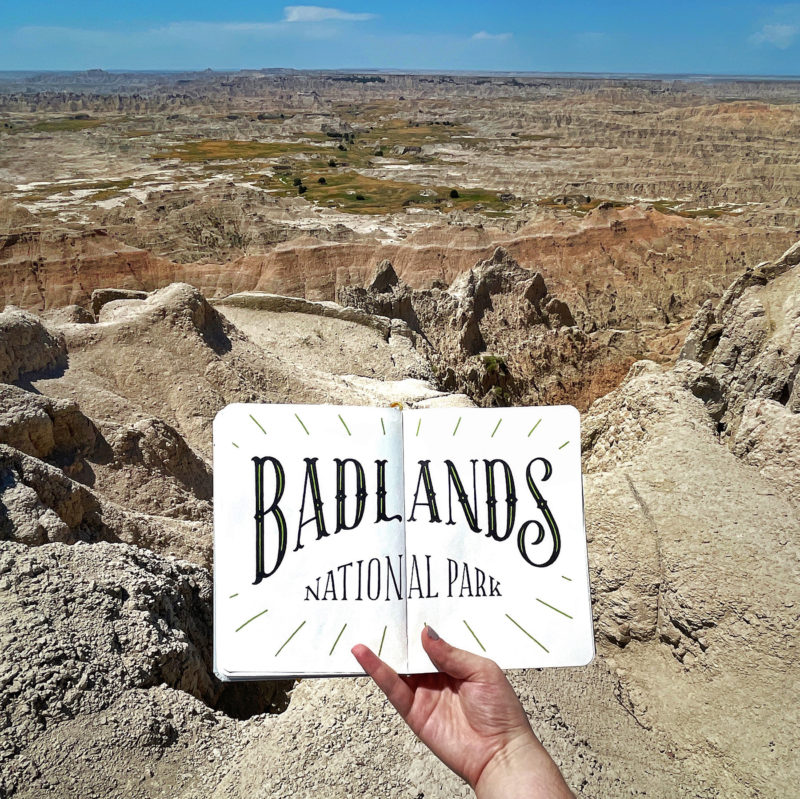
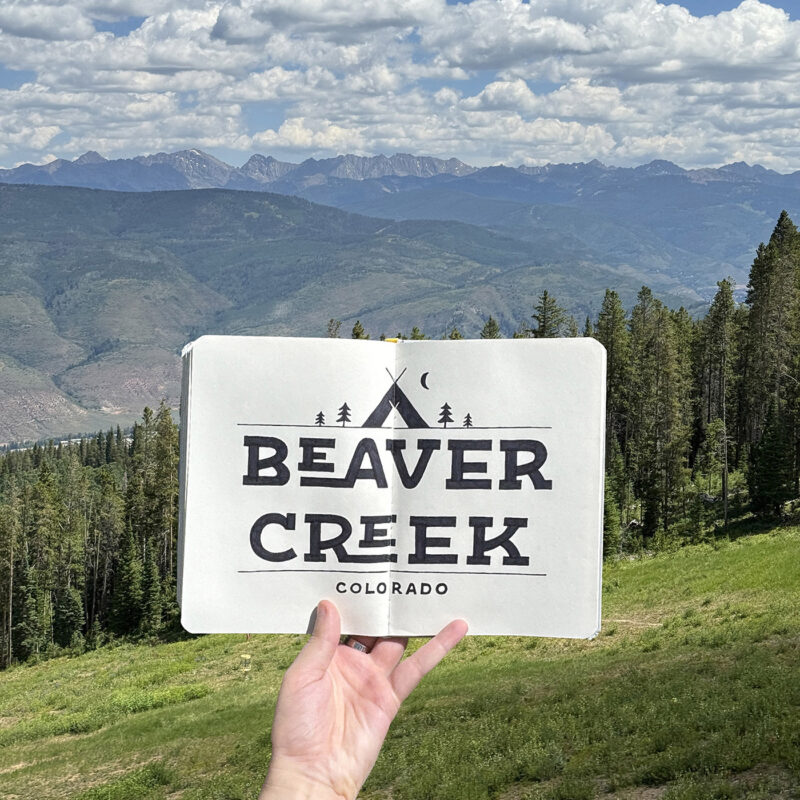
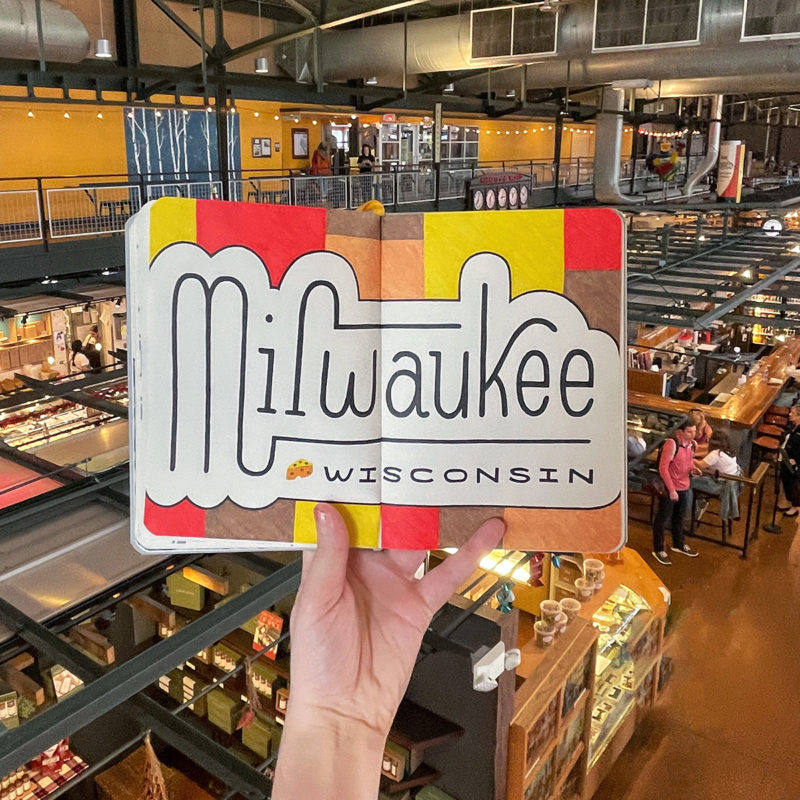
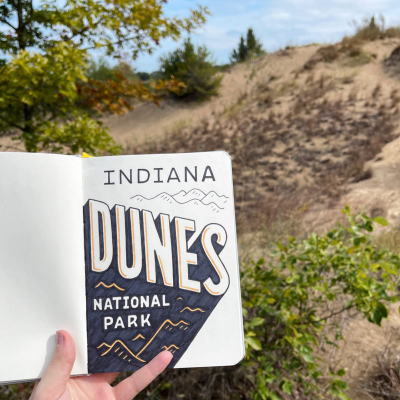
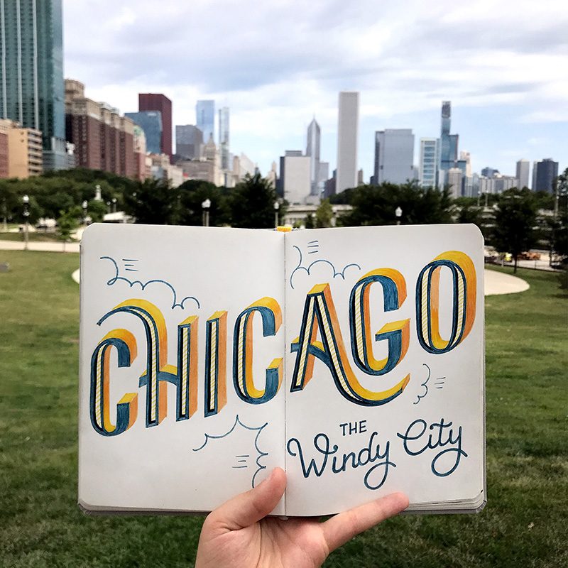
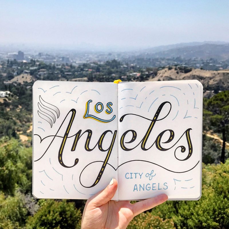
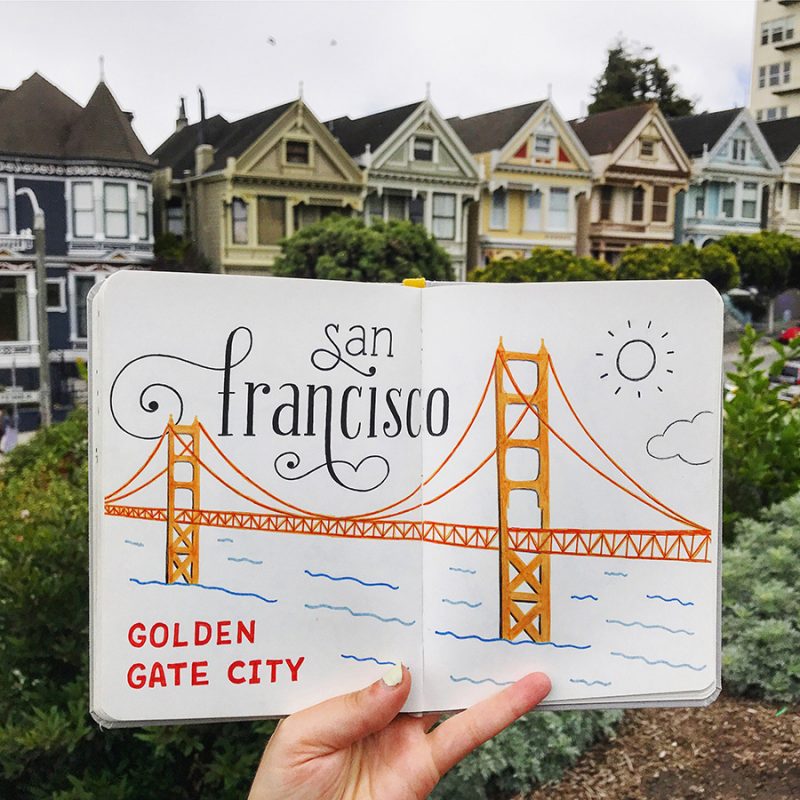
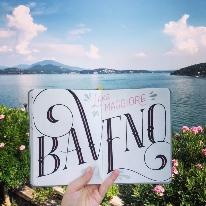
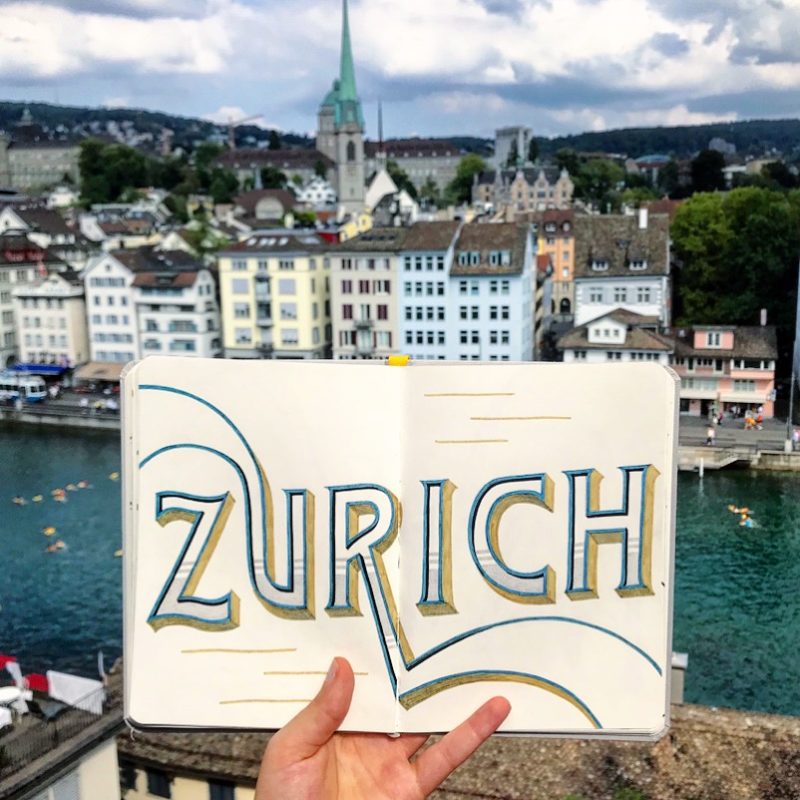
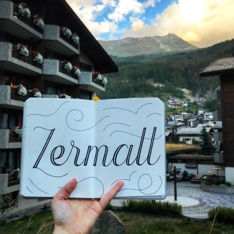
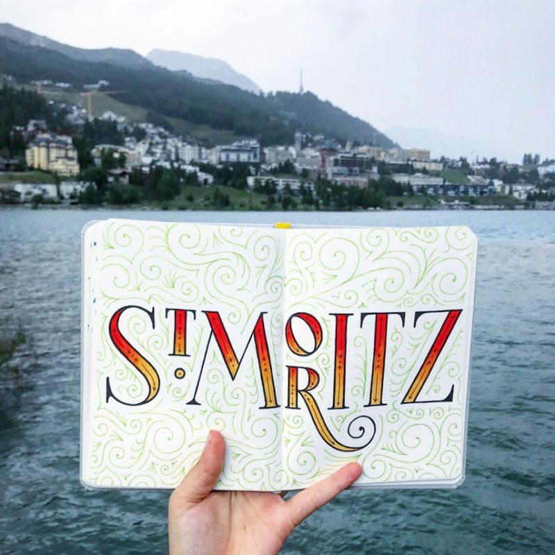
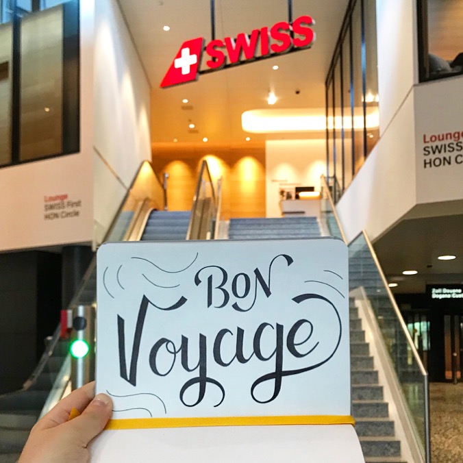
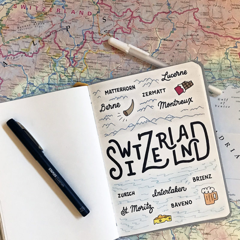
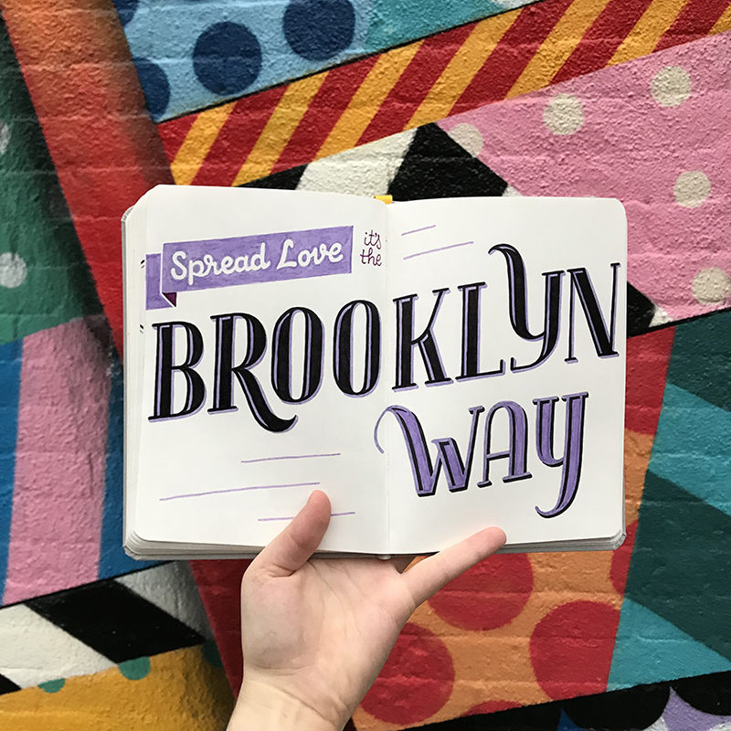
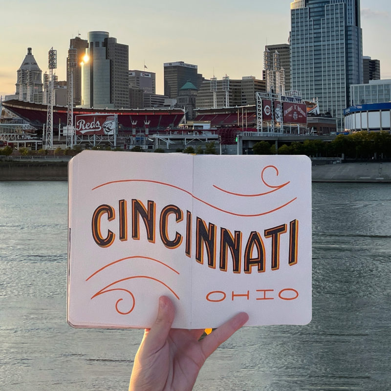
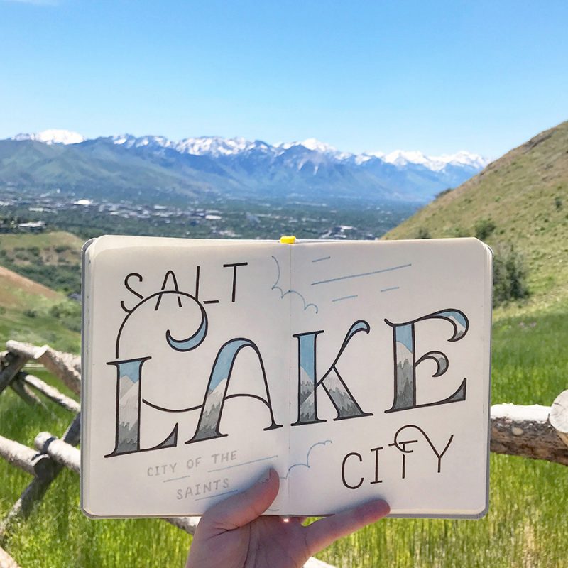
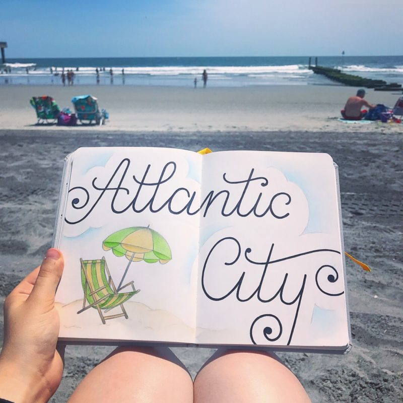
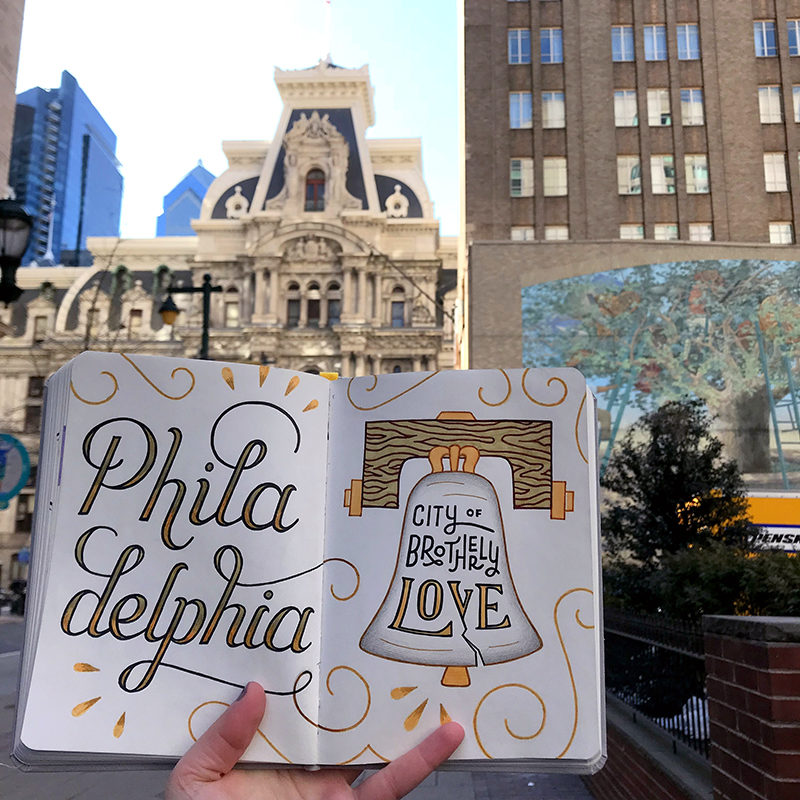
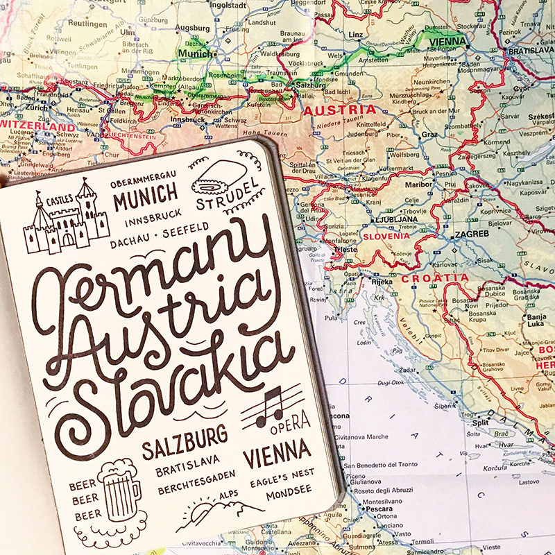
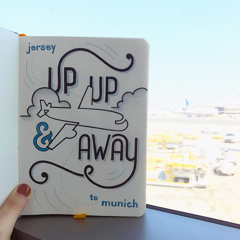
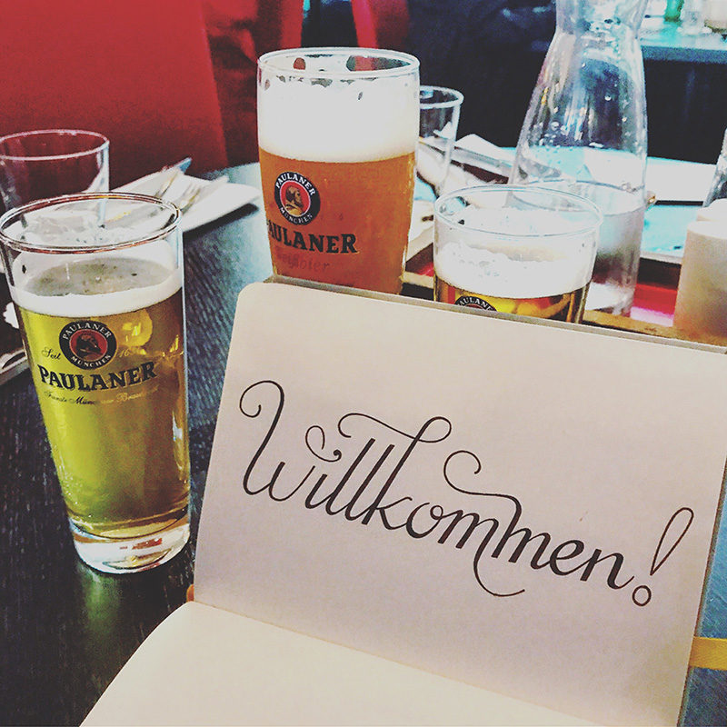
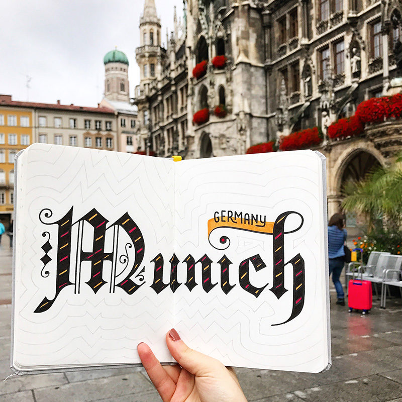
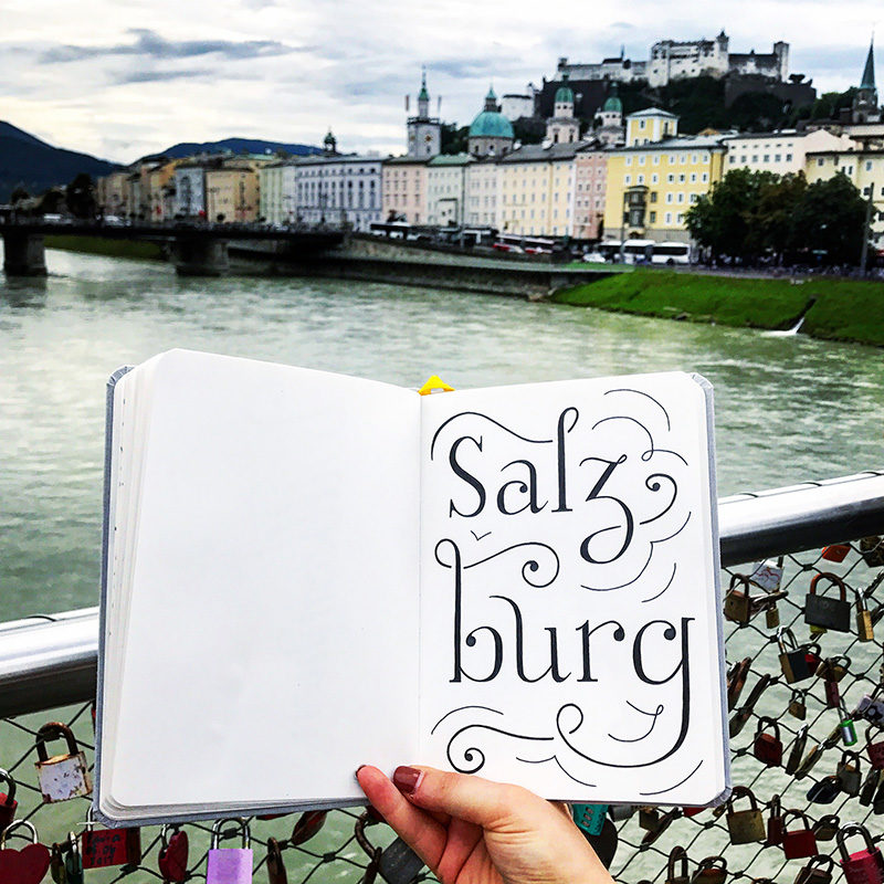
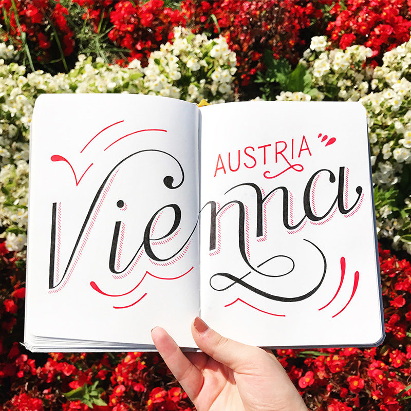
This sketchbook series chronicles my globetrotting throughout the years. If you read about me, you would know that travel is where I draw a huge amount of my inspiration. Being able to experience another culture and broaden my understanding of the world has a huge impact on me. It also enables me to try out lettering styles that are indigenous to the region. So, every time I travel, I make a point to bring my sketchbook along with me and experiment. It allows me to chronicle each trip in a very personal way and to flex my photography muscles as well. Not only must each sketch be prominent in the composition, but the background must provide the necessary context to represent the location. Some sketches feature the city name, others incorporate the native language, and others summarize the entire trip. The latter provides a significant challenge in developing a dynamic and legible layout.
The bulk of my lettering work is done digitally with an apple pencil, however, with this project I am able to return to analog. I find that going back to basics reminds me to hold true to the core principles and values of design; hierarchy, color, and contrast. Additionally, the physical sketchbook adds a human element to each piece which brings forth even more personality. People capture tourist destinations thousands of times each day. However, I’ve found that a hand drawn sketch incorporated into a cityscape or landscape produces a much more dynamic, unique, and engaging photo.
