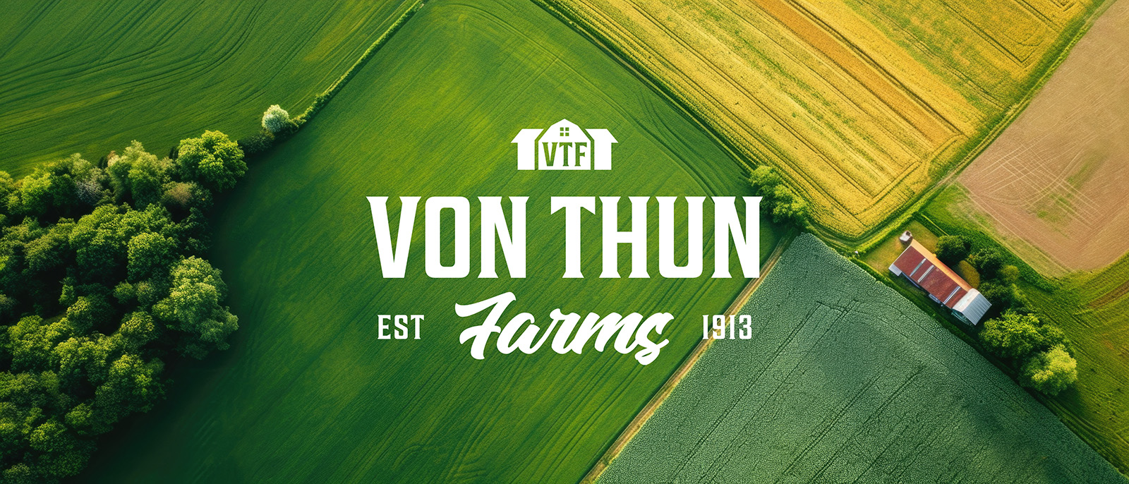
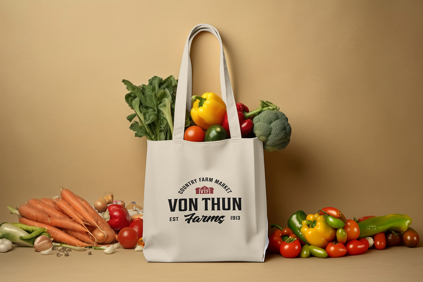
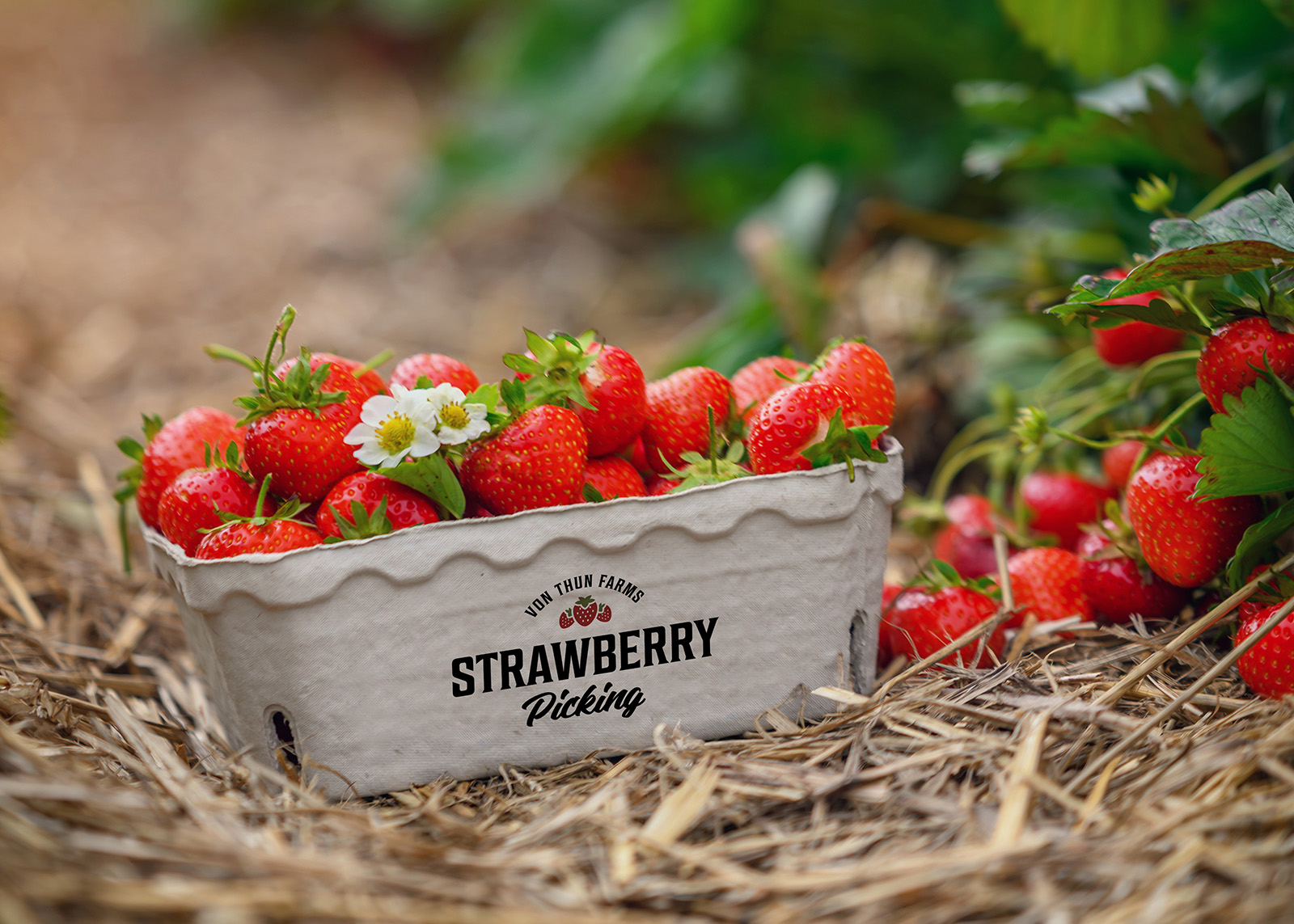
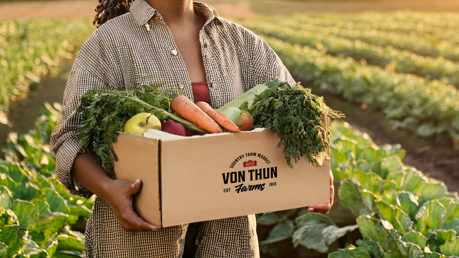
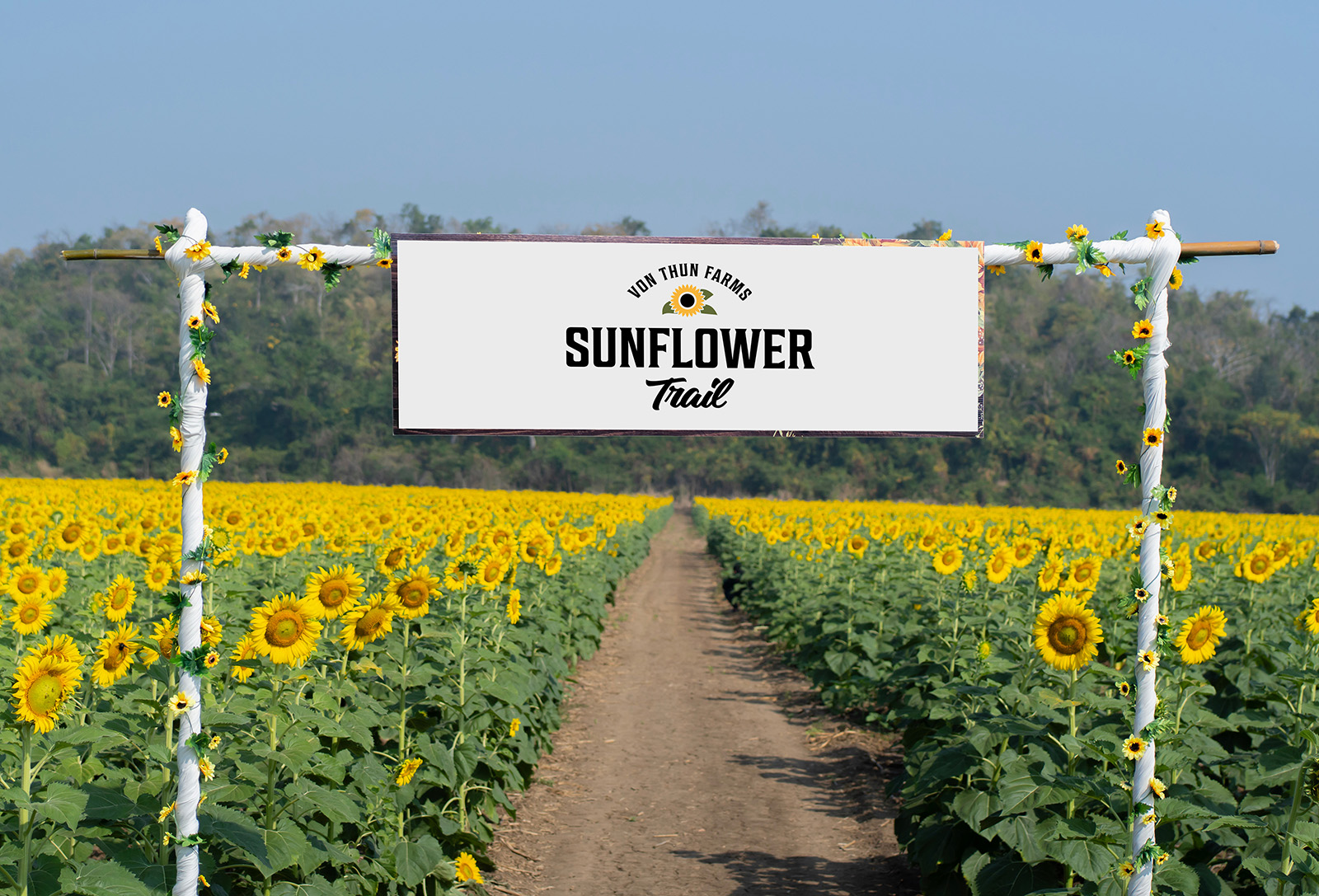
Von Thun Farms
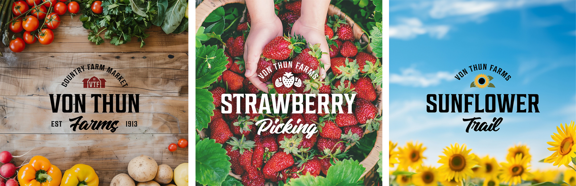
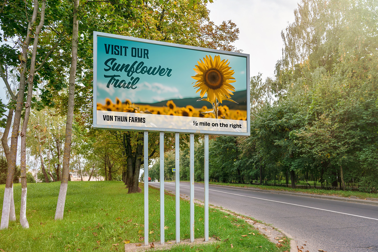
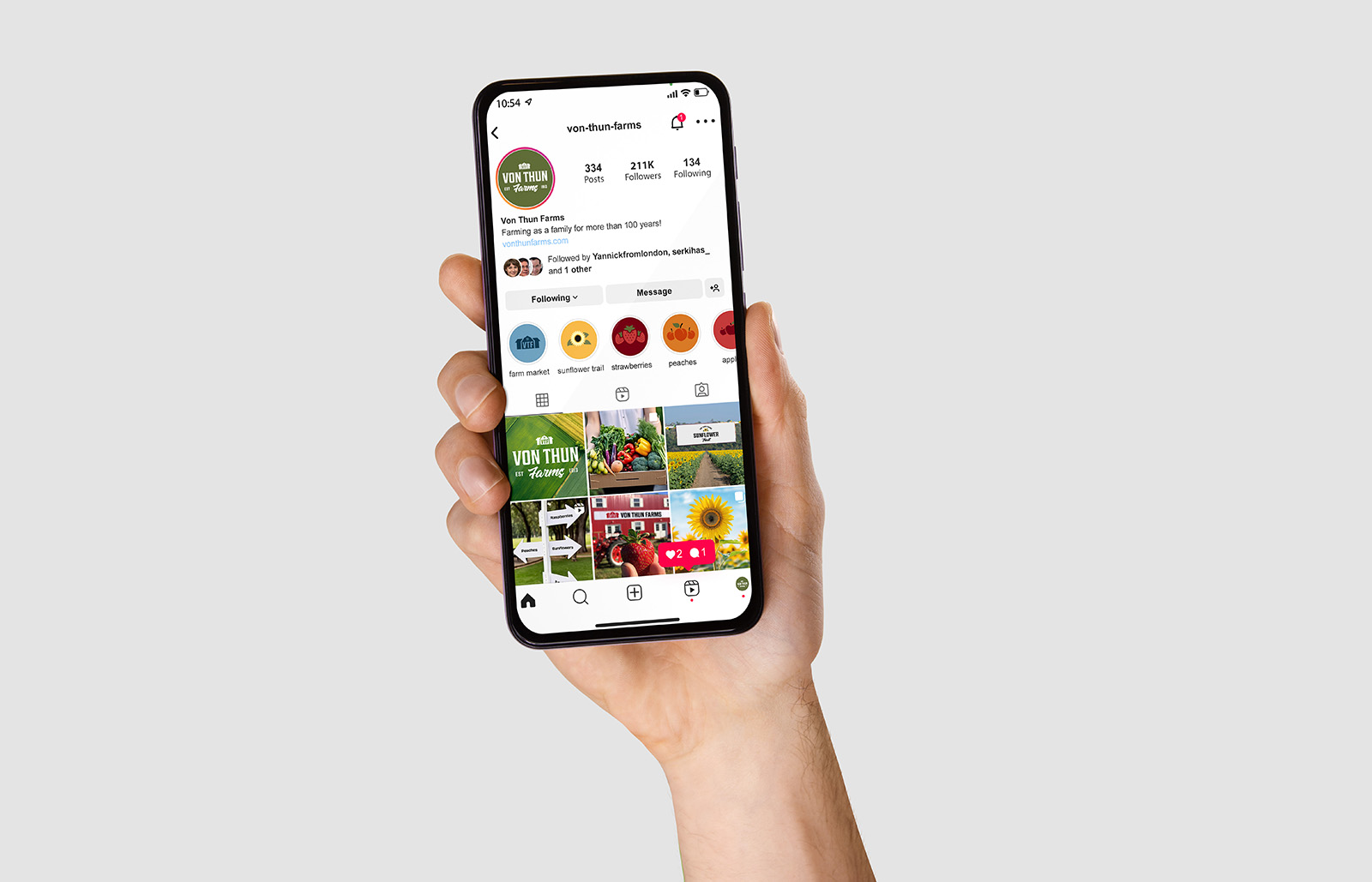
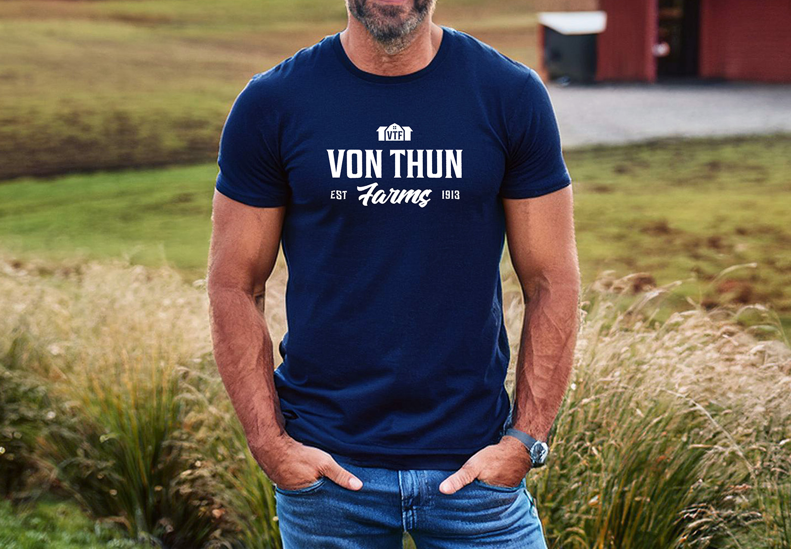
Von Thun Farms is a family-owned farm since 1913 operating in South Brunswick and Washington NJ. In rebranding Von Thuns to show them what their brand could be, I endeavored to make a mark that would work across a variety of media: packaging, social media, apparel, signage, and more. I also wanted to create a logo system to account for all of the services offered at the farm: the strawberry picking, apple picking, peach picking, and the sunflower trail. To do this, I created an icon system to make each logo distinct. The main logo icon maintains the original concept of a barn, but elevated and with the initials within.
For the logotype, I chose something that was slightly vintage to speak to the heritage of the brand. Von Thun Farms has been around since 1913 and has been in the same family for 6 generations. Because of this, I felt that honoring that history was essential. The script at the bottom adds a welcoming and warm aesthetic. Overall, the logo needed to be bold but friendly, organized and utilitarian and I strove to achieve this balance.
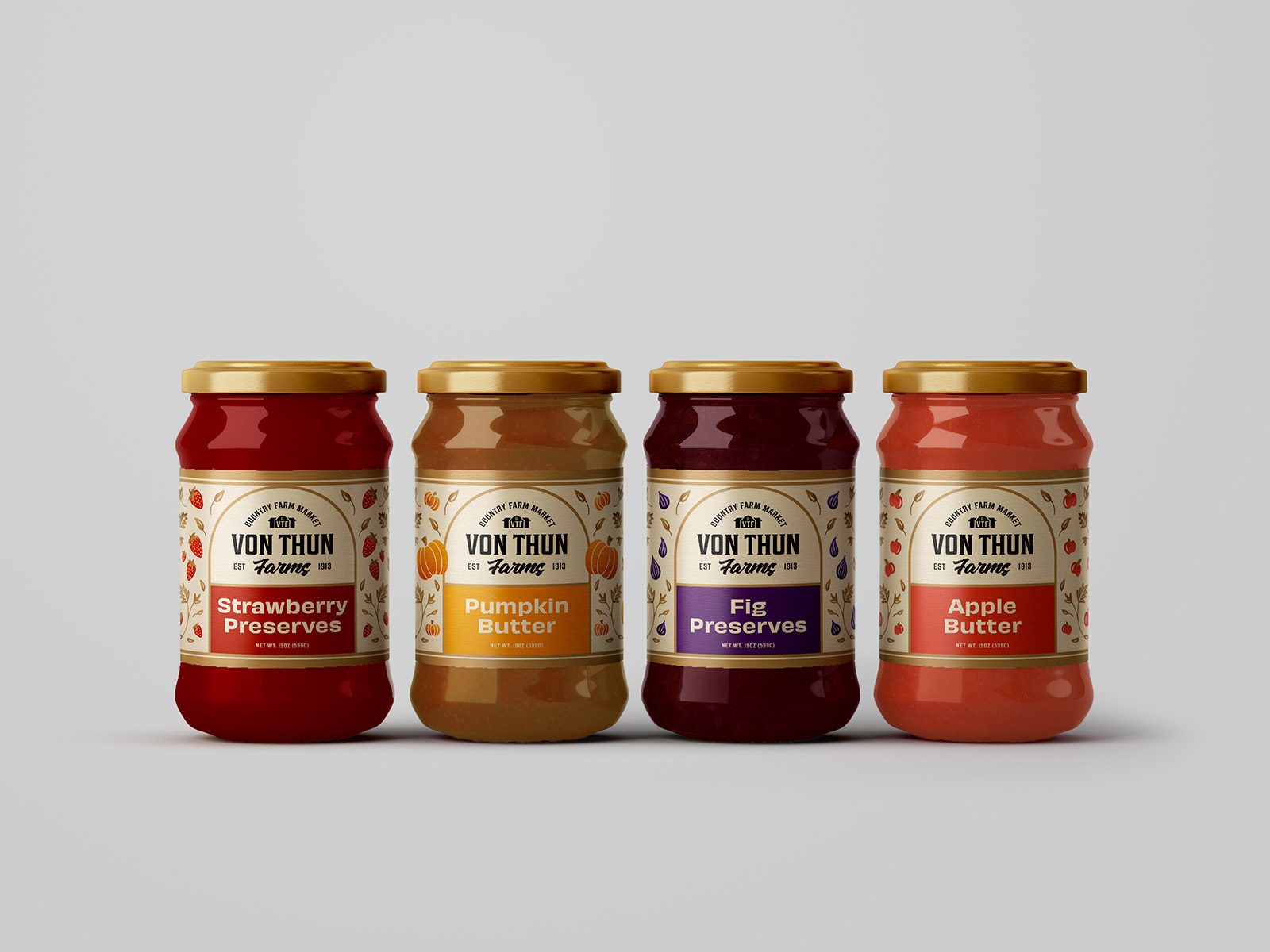
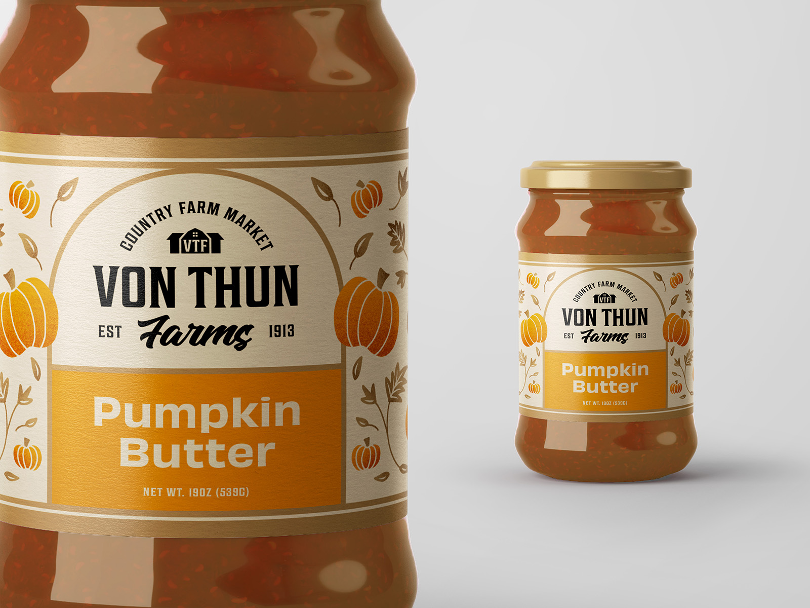
My aim for the Von Thun Farms Country Farm Market package design was to anchor the logo lockup in a distinct shape and then have custom illustration for each product. In this way, the pumpkin butter, for example, would be visually distinguished from the strawberry preserves and other products. The illustrations are simple, elegant and playful with a slight depth for texture and visual interest. My ultimate goal was to create a package design that is rustic yet refined.
This brand needed to be flexible and work across a wide variety of assets. I did this by creating a system that was strong but inviting, timeless but modern. This family-run farm now has an identity to last it for the next 6 generations.